G. Burly was supposed to fix the Water Feature today.
(Pause for howls of derisive laughter. Howls!)
He showed up after I’d left the house in the afternoon, and was present when I returned at 2:45 or so. He agreed: the pump doesn’t work anymore, since it blows out any outlet into which it is plugged. As for the Water Feature itself, he strongly suspects a leak.
Really! Well then. Changes everything, doesn’t it? Here I thought invisible storks were showing up and drinking all the water.
I left to pick up Gnat; when I got home he’d left a message saying that he’d filled the top tank to see how far down it went over the course of the night, and he’d be back tomorrow.
The rate of leakage in the top tank has been constant since, oh, October, but again: he’s new to the job, and doing his best. G. Burly will fix it or die trying, I suspect.
After gymnastics we went to McDonald’s for our weekly little outing. Sometimes the place provides an interesting sociological slice of suburban life, and this was one such day. The staff: all Hispanic. The manager wasPasty McDorkington, but he knew his stuff, and for once I felt as if someone appreciated my ordering style: object first, modifying attributes second. If you order a grilled chicken bacon salad, for example, the clerk has to process your order backwards. If you order salad, bacon, chicken, grilled, it follows the order in which he has to enter the information. If you say “medium” his mind automatically stores the word while waiting for the noun – drink? Fries? Sundae? So you say coffee, medium, black. And you get a large milk. But you tried. He switched between English and Spanish twice during the conversation as he shot orders back to the kitchen; he was also taking commands from a Borg implant hooked into the drive-through. They don’t pay him enough, but someday someone else will.
Customers: Hispanic family of four, the two kids impeccably attired, Dad in some sort of indistinct uniform, all speaking Spanish. Prayer before the meal. An overinflated young buzzcut white guy with a Vegas poker T-shirt, bouncing on his heels. Two trashy scowling large-bottomed types yelling into cellphones while they ordered; one had fingernails that could open an envelope from across the room. A few oldsters from the adjacent development – a perky birdy lady wearing a pound of foundation and a wig you could have blown off with a hummingbird sneeze, a tall glowering old coot whose manner fairly shouted “at least at Denny’s they bring the food to you” and an old guy who gave off trembly waves of suspicion, as if the entire McDonald's corporation had been created many decades ago so they could short-change him a dime today. Where do they sell those old-man jeans? They don’t look even attempt to look like true denim - they’re some polyester simulacrum, and they have cuffs. So much of the wardrobe opportunities for old men makes them look like progeria sufferers; they don’t look old or respectable or patriarchal at all. They look lost. There's simply something sad about old men in sneakers and nylon sweatpants. When you hit that age you ought to wear a jacket and a tie and a sweater vest and a porkpie hat and sit in the corner, nodding knowingly, sipping cappucino, waiting for someone to come by and pay respects. And if they don't? Kids today. Whaddya gonna do.
As we ate I noticed three new patrons, all in their mid-20s: a very attractive African-American woman, model slim without the hauteur; a good-looking trim Asian guy with wrap-around sunglasses, and a grinning handsome Caucausian with a soul patch and a knit cap. My God, it’s a royalty-free stock photo come to life! Really: they looked like the people you see on a website for some new useless internet service, grinning toothily at the camera. Or secret agents from a “Mission: Impossible” movie. They all wore leather jackets, too.
Swear to God: after they’d finished eating they walked, laughing, to the parking lot, hopped on three low-slung motorcycles, and roared off. If I’d seen all three in a McDonald’s commercial, I would have thought it nonsense, but here they were. Maybe this was a commercial. Maybe McDonald’s paid them to roam the country and administer Hip in small piquant slices.
Me, I’m wiping caramel off my kid’s face. And that’s fine.
She ate all her apples and declined the fries. I studied the bag, which reminded how McDonald’s always gets the graphics wrong. Maybe they connect with someone, but nearly every single example of McDonald’s graphics leaves me dead. Example from today:

Welcome back, 1977! The big quotes, the horrible roundy-edge coffee logo with the unnaturally conjoined U-M – it all shrieks Carter-era design.
Helpful hint, miss: see that thing on top of your portfolio? It’s called “a handle.” Give it a try.
The bottom of the bag – I know, who reads the bottom of a bag? Well, I do; I read everything when bored – had a peculiar touch one often finds on bags: the names of the guys who made it.

I imagined Carl and Lenny from the Simpsons giving me a thumbs up: hey, hope you enjoyed the bag! Paper products often have these personal touches; I see them on grocery bags and corrugated boxes. Probably wouldn’t work on condoms, though.
Well, let’s see what’s on the cellphone camera this week.
The first shot comes from the school where Gnat takes piano lessons. It’s a huge post-war suburban school that’s been decommissioned; the new school is next door, and the old one’s been turned into a rambling community center. As an example of 50s educational design, it’s priceless, and you can imagine George McFly getting the books knocked out of his hand as he cowered under an Enchantment Under the Sea poster. The urinals, for instance, are those long-maw types that go right down to the floor. It's been overhauled many times since it was built, and the latest round of renovation has revealed many secrets. I found an old suspended ceiling under the newer suspended ceiling, for example. Makes you wonder why they bothered, really; perhaps there was some new theory that suggested low ceilings make for calmer hallways and more docile charges.
When they ripped up the old ceiling, they revealed this:

Pyrobar! I have no idea how I knew this, but I knew in a second that USGC stood for the United States Gypsum Company. I was, of course, correct.
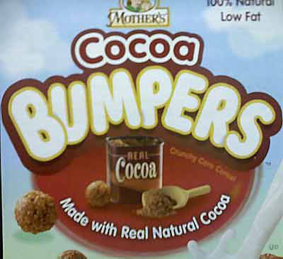
At the grocery store I took these shots in the aisle that always depresses me: organic breakfast food. Package design is not the strong suit of these manufacturers.

The young lady on the left is nice, but the one on the right looks like Darryl Hall after burn-reconstruction surgery. And then there’s the usual eco-hoohah:

Look. When you put a box of “Cinnamon Toast” cereal on the table, the kid knows what he’s getting. “Gorilla Munch” doesn’t really nail it down. Particularly if the Gorilla appears to be gazing at the person holding forth the bowl, sizing him up for a game of poker. And I don’t get the part about “1% of sales donated to wildlife” – makes it sound like they send someone into the forest and throw wadded-up fifties at random animals.
Rule: cereal names should never resemble porno complilation titles.

And who could turn down this:

Mighty Bites, with the unforgettable anthropomorphic cereal shapes! Tiny men awash in a sea of milk? Freud party of six, your table is ready. It’s no better in the Malt-o-Meal or house brand cereals, of course; they have also-ran mascots, like a kangaroo with sunglasses, or a penguin with a clown nose. General Mills snapped up all the good cereal promotion talent, it seems. But you still think they could come up with a box that didn’t make the kid feel like an Amish in a zipper factory.
That’s it for today; new Quirk, of course. Thanks for reading, and I’ll see you tomorrow.
|
|
|
|
|
|
|
|
|
|
|
|
|
|
|
|
| Su |
M |
T |
W |
Th |
F |
S |
|
|
|
|
|
|
8 |
9 |
|
|
|
|
|
15 |
16 |
|
|
|
|
|
22 |
23 |
|
|
|
|
|
29 |
30 |
|
|
|
|
|
|
|
|
|
|
>> |
|
|
|
|
|
|
|
|
|
|
| |
|
|
| |
|
|
|

