|
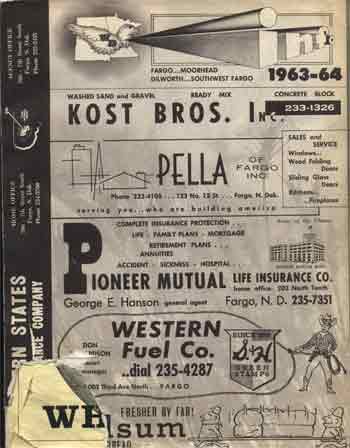
 The new phones books arrived today. Usually not something I note unless I’m desperate for a column. (Years ago I reviewed one, treating it like a piece of literature. Hah! Boy, that was original.) But this time the phone book is truly different: it combines yellow and white pages, and splits them into two big two-toned books. The new phones books arrived today. Usually not something I note unless I’m desperate for a column. (Years ago I reviewed one, treating it like a piece of literature. Hah! Boy, that was original.) But this time the phone book is truly different: it combines yellow and white pages, and splits them into two big two-toned books. If I might have a word with the person who came up with this idea: you’re an idiot. I’m sure you have plenty of marketing surveys that show people LOVE the convenience of having these unholy abominations, but I know what you’re up to. I know exactly what you’re up to. First, let me state what you already know: the Yellow Pages can be a confusing place. You want your house painted – do you look up Painters, or Home Improvement? You want to get your dog’s orbs snipped – do you look up Animals, or Pets, or Vets? Everyone knows that annoying moment when you look for a category that makes perfect sense to you, but when you get there you find a reference to what THEY think the category is really about. You want a vivisectionist; THEY refer to the “Islands, Scientists, Mad, Dr. Moreau” category. So why do something so obviously stupid? Because they don’t own the Yellow Pages market anymore. There’s a new competing book in town, just as big, just as yellow – but it lacks the lineage that somehow confers legitimacy on the Dex Yelllow Pages. From Qwest you can trace a direct line back to a Bell, I think, and for some reason that’s comforting. (The Yellow Pages were the original Google. The strength of the brand is so great that decades after it was invented, we identify the nature and purpose of these gargantuan tomes by their hue.) In Fargo the White and Yellow pages were combined in a single volume, because Fargo wasn’t big enough to split them off. Here’s what the cover of the 64 Fargo phone book looked like. All ads.  The front of the book was the Yellow Pages, and it had categories you won’t find today: “Self-Employed,” for example. “Clergymen” was another. You paid to get in. You paid more for boldface. Perusing the residential listings, you’re struck by the info each listing gives: not just your phone number, but your address, your spouse’s name if you’re not the primary listing, AND the names of your children AND the years of their birth. AND your profession. It was quite intimate, compared to today’s phone books. Small town. No secrets. Anyway. So why have they split up the books and combined them in a user-unfriendly way? Because they have the residential listings, and the other Yellow Pages doesn’t. When the new Yellow Pages from the competitor arrives, it doesn’t just strike you as a duplication, but an addition you don’t need. If you liked the competitor’s Yellow Pages, you’d throw out the Dex and use the new one. But if you throw out the Dex now, you lose the local listings. Brilliant. And annoying as hell. Does all this whet your appetite for a 1960s radio commercial about walking through the Yellow Pages? I thought it might. Man, I love that tune. It’s just lemon fresh. Scottish kilts for Highland flings! |
|
||||||||||||||||||||||||||||||||||||||||||||||||||||||||||||||
|
|
.....


