 |
|
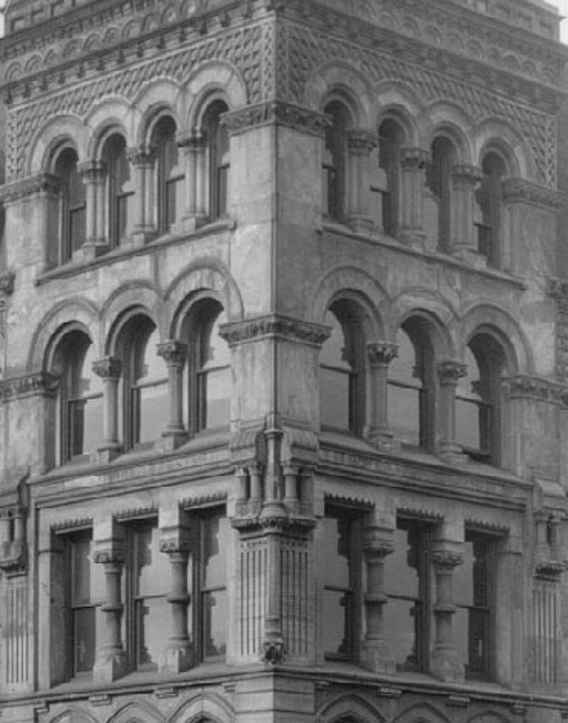
A perfect example of one of those most beguiling and characteristic traits of mankind, once upon a time: buildings did not have to look like this, yet they did. They could have saved a great deal of money and made the façade utterly plain, but they lacked the intellectual and aesthetic justifications. Alas, they’d come along soon enough.
This could be a slide in an old architecture class. Subject: avoiding top-heavy towers. The windows on the bottom are square; that’s your foundation. The windows above have arches, which lighten the look and push the eye up; above them, three windows become four, which accelerates the upward momentum. The columns are thicker – but they’re arranged in clusters of three, which keeps the momentum going without making the building too light on top. Brilliant! |