A real crease to the wind today. It blew in some snow, big random flakes that milled about in panic and confusion like extras thrown on stage before their cue. Then sun! Then clouds, then completely overcast but sunny. Tonight it will probably be yellow at midnight.
We get that here. I don’t understand why. If I had to guess, I’d say something in the atmosphere reflects city lights, but there can’t be enough of that for this.

11:23 PM. You get used to it; when you walk outside and it’s pitch black, well, it’s night. That’s what happens. If you walk out and it’s bright and yellow, well, it’s night. That happens too.
Potpourri today, because I am spending the evening on the novel. I encountered a minor difficulty yesterday, when I took a look at 45% of the first half and realized it has to be redone. I don’t know if I’m just sick of it and over-analyzing, or being rigorous for a change. All I know is that it has to be done again. This is the miserable part of the job. Walking around, thinking, realizing what’s wrong, how you’ve written yourself into corners and traps.
If you missed it, you may enjoy the story of how King Vitaman helped invent the 8-Track tape. It was the work blog today.
This poster from the upcoming Mad Men season surged through the web yesterday and this morning, as people briefly made themselves feel like experts on 60s commercial illustration by reading the Times piece. It's by Brian Sanders. I don't know why I was so sarcastic in two sentences back.

It’s certainly apt for the era. I hope many people clicked through a site about the fellow’s work, where the first image suggests he had his favorite motifs: the illo below was done 49 years ago.

The blog notes that he was influenced by people whose styles were much more abstract - Ben Shahn, and David Stone Martin - a fellow whose style sums up everything I don’t like from the period. (I don’t like Ben Shahn, either.) Anyway: the more Sanders got away from his 60s style, the more I like his work.
Then there’s this, on today’s Tumblr. Not to recycle, or anything.

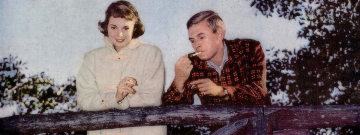
Roy Besser, about whom I can find very little. Hard to think he did this from 1959; it’s so much worse. It also appears to be an endorsement for the upcoming presidential campaign. He did many in the Pepsi series, which can be found at the invaluable Today’s Inspiration site. It’s a wealth of images from the waning days of great American advertising illustration.
These things don't just define eras for the grown-ups who buy things; they shape your initial perceptions of the world when you start to look outside of the kid-themed universe in which you've dwelled for your first tender decade. I have no personal reaction to the Pepsi ad, except - as noted on the Tumblr, that I think the couple not only has taste and style and leisure time, they also have an arrangement. It's an interesting historical artifact from a transitional era - say, 1958 - 1963. The plates were shifting.
The "Mad Men" poster above reminds me of my early youth, and not in a warm nostalgic way. The style of art on posters and paperback covers was sketchy, inconclusive, incomplete. Disordered.
It changed around 1980, more or less - graphics got cleaner; the late 70s retro-airbrushing styles had done their work. (The "American Graffiti" poster spawned innumerable imitations.) Photography replaced illustration in ads. I look back on the stuff I grew up with, and I think of used book stores with that old paperback smell, musty stacks, something adult I didn't quite get, but was old enough to understand that there was something I wasn't getting.
A transitional era. They're all transitional era. |

