There’s nothing like writing a book to make you not want to write a book. Of course, by then it’s too late. I’m usually in the writing mood, but I haven’t been in the zone for two weeks now, and it’s annoying. It’s as annoying as . . . see? Nothing. It’s as annoying as an incomplete simile. As I’ve noted, I have a book due at the end of the month, so the Bleat will consist of whatever scraps have fallen from the scanner, complete with links to things everyone’s already seen before. I’d nothing better than to ramble on here in the usual fashion; these entries are often the most enjoyable because they’re the least consequential, and the most disintermediated. Like that word? I just learned it the other day. It means what it looks like; there are no intermediaries between me and you. I have a free rein at the paper, although a few words and sentences get taken out from time to time – but the newspaper is the very embodiment of an intermediary. Hence the loss of the youth market, apparently: the more levels of intermediation, the less interest they have. Part of the appeal of YouTube might be the ability to comment on everything, a feature that demonstrates the perils of applying egalitarian ideals to criticism; YouTube message threads seem populated by the largest collection of morons on the planet. Then there’s this cartoon, which I saw posted in our newsroom union bulletin board. (It's the 01/03/07 cartoon, if the link doesn't hit the right one. Look for three kids on a sofa.) I hope that’s not what people at the paper believe. Ah, if only the Internet didn’t lure our impressionable youth with salacious photos of washed-up pop stars flashing their naughty bits, kids would buy newspapers for things that really, truly mattered to them, like Garrison Keillor’s column. All of which is a long overheated way of saying I probably couldn’t sell my editors on a piece about 1950s color schemes and why I like them. Just as well; not much meat on that particular bone. Just colors, and the fact that I like them. Sometimes. Now and then, I pause, and reconsider:
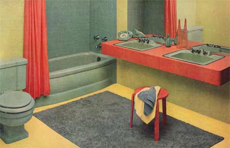
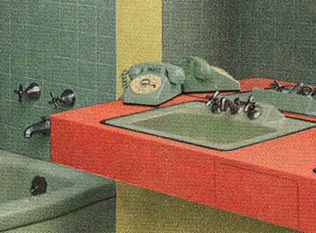
Give those colors a few cocktails, and they'd start fighting. There’s something arrogant about the coral hue: Yeah? So what? I'm here. Get used to it. Let me tell you something, Mr. Seafoam-green toilet, at the end of the day I'm the only stool in this room people don't try to get rid of. The color of the floor I’ve seen before, when my dog throws up bile. Bonus points for the matching phone:
That was high luxury in '56; a phone in the bathroom in a custom color. The modern equivalent would be a flat-panel HD TV in the shower - an extension of existing technlogy expanded forward into the realm of luxury. The ad notes that the colors were designed by “Howard Ketchum, noted color expert.” So he was. He designed the color palette for Lustron homes, among other things. Then there’s this, from the same 1956 magazine:
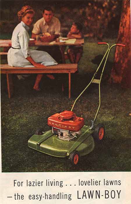
A thing of beauty. Loud, hard to steer, and inevitably coated with a oily sheen of petrochemical waste and minced lawn, but in its natural state, it’s lovely. The green stands for the lawn; the red stands for Power, which give you dominion over the lawn. Why, even wives cannot help but turn around and regard the device with admiration. Small children look up to their role models, wondering when they’ll be able to use it. Men stare ahead with resolute decision, knowing that great power brings responsibilities as well. In fact, it’s almost as if the machine is a family pet, like a dog. It belongs to them, and they belong to it. If the colors were pink and orange, it wouldn’t be the same. Much thought goes into these things, and it’s one of those wonderful by-products of peace and prosperity. When you’re not dealing with famine and invasion, you can study which hues produce particular emotions specific to all manner of tools and furnishings. Sometimes, however, the research gets it wrong. if you're ready: Josie and the Pussycats meets Clockwork Orange. Warning: safe for work, which means you don’t have a good excuse not to look. More of the same tomorrow, which means less of the usual. But on the other hand: this means a book for Chiristmas, and money in Gnat's college account. New Quirk & new Match as well; the latter contains a uniquely potent 70s horror, if you wish. Oh, what the hell - might as well pad it out and put the match here.
A finer example of fern-bar horrors you will never find. The picture: a tub with human feet. And hands. The name: “Bobby McGee’s,” a reference to a miserable song screeched out by a drug addict who couldn’t aim for a note without splattering its neighbors with buckshot. The kicker: it’s not a restaurant, it’s a Conglomeration! Fern-bars always had names like this - W. C. Dillinger's Amalgamated Food and Drinkatorium Company. Gaah. And it’s still around! Says one review: An original feature of Bobby McGee's Restaurant is the talented service staff who serve and entertain wearing costumes bearing the likeness to comic book, movie, TV, or well-known historic and contemporary personalities. Hell, in other words. But the reviews elsewhere are great. I suspect they’ve changed the matches to reflect the times. And I suspect that if you walk out on the bill, only to explain in the parking lot that “Freedom's just another word for nothin' left to lose / Nothin' don't mean nothin' hon' if it ain't free, no no” you’ll find that their version of the Bobby McGee philosophy may differ from Kris Kristofferson’s. There. Saved you a click. See you tomorrow.
|
 |
