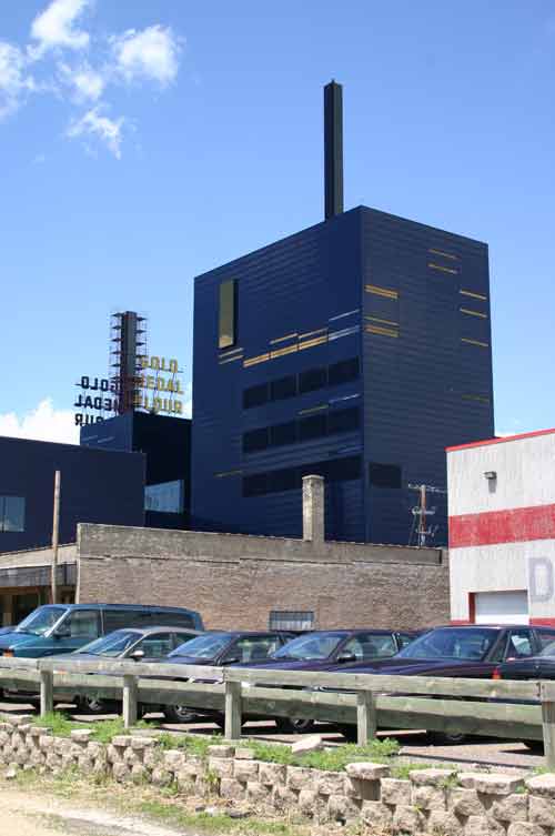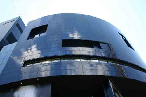

I’m certain this will irritate the more progressive elements in the architectural community - no, let me rephrase that. I don’t think they would care what I think at all, and would probably welcome the forthcoming autodestruction of my own credibility. Shows what I know, which is next to nothing. That said: What does this look like to you?
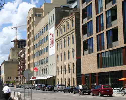
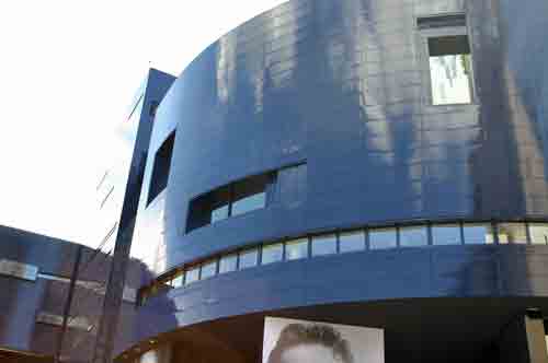
A crematorium for International Style architects? The box in which a much more interesting item was shipped? This is the new Guthrie theater, the last of the three new cultural “crown jewels” in Minneapolis. The first was the Rock ‘Em Sock ‘Em Walker, which still continues to glower down on Loring like an Elder God from the planet Aluminium; the second was the Central Library, and the third is this, the Guthrie. It replaces a much smaller and generally venerated structure by Loring, and like the Walker, it was designed by a European. (The Library comes from the Pelli shop.) I don’t know what it is about European architects that makes them irresistible to American clients. I don’t know why Yanks go weak in the knees when presented with something that has as much to do with our particular culture as the Golden Arches have to do with the Champs Elysee. Maybe this is revenge. Scroll up and look at that thing again. Of course, that’s just one view, but it’s the biggest. Note, if you will, the elegant and sure-handed placement of the windows. Le fenestre juste! Note how they appear completely arbitrary, no? That’s the sure sign of a careful, detailed plan. Note how the sleek skin of the building is smooth and flush, except when it’s not: a giant framed window protrudes from the upper floors, and like the other windows, it has the same hue: smoker’s teeth. As for the smokestack, well, perhaps it’s a reference to the area’s old industrial past. It’s actually a marquee. Words scroll up the sides, using that new-fangled “moving bulb” technology first perfected in Times Square in the late 20s. Let’s examine the context. Here’s the street on which the new Guthrie sits. New buildings, old ones, a skyscraper rising down the road. You can still read it as a coherent street:
Enter the Guthrie:
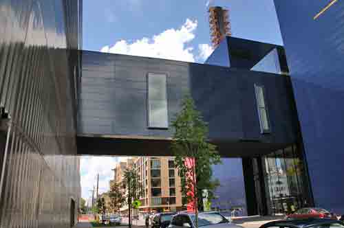
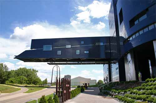
That skyway is a gigantic crossing-gate slamming down on the street. Could they have made it transparent, like the other skyways in town? But I just answered my own question, didn’t I. It is not like other skyways! It is the Guthrie Skyway! If you peer, you may glimpse them moving scenery from the shops to the theater through the thin windows.
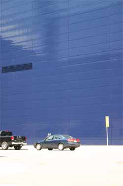
As for the building’s interaction with the street, well – it doesn’t have a great deal to say, other than “Damn, I’m blue.”
And then there’s the face. Can’t build a new Euro-style cultural complex without inadvertent anthropomorphizing. Here we have the face of a fellow whose wife dragged him to the Guthrie, and it’s the middle of the third act, and he really, really has to use the bathroom:
It’s the face of the dramaturg asked to research Nazi culture for yet another update of a Shakespeare play, with the stipulation that he avoid swastikas and the color red. It's like they modeled him on the Boss level of Tron. But it gets better. The most highly-touted feature of the building is the cantilevered bridge that exists, as far as I can tell, to complicate intermission. You get out of your seat, make it to the lobby, dash to the bridge – because no night at the theater would be complete without standing with a plastic cup of wine looking down at the river, thinking “I am the sort of person who looks down at the river with a plastic cup of wine during intermission of a play I can respect in the abstract without necessarily enjoying in the specific sense of the world, although that fellow who plays that one guy is pretty good.” When the designs were first released, I thought it looked like the Guthrie was sticking out its tongue at the East Bank of the Mississippi. I thought the bridge would take advantage of its scenic heights, and thus be – well, transparent as a skyway. Little did I know:
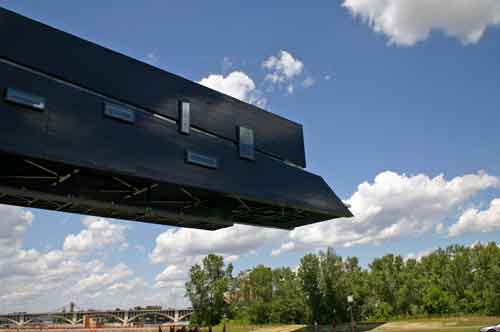
The shuttlecraft has docked! And judging from the looks of the Tron Dramaturg, that hurts. Note the structure under the bridge to infinity (or nowhere, depending on your opinion) - that appears to be an open walkway from which spacious views may be obtained. (“Spacious” in the sense that a giant metal structure hangs close ovehead.) The actual bridge has the same blue glass, a thin line through which views may be glimpsed in the approved measure, and larger windows with mirrored frames that provide additional view-enhancement. I suppose the architect wished to draw people to the tip of the structure for the complete ooh-ahh moment, to shoot them down the tube to the moment of ecstatic relief at the tip. But by the time you get to the end, I suspect you’ll hear the piped-in horns that signal it’s time to head back in. From below, it really does resemble a scout craft from “Independence Day.”
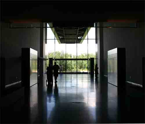
So I love it, right? I do not. I don’t dislike it; I don’t feel anything about it, which is probably worse. I’m already used to it – just like the Metrodome. The interior spaces are nice, I understand, but I expect they will be somewhat severe. Here’s the lobby:
Show this picture to anyone, and they’d be hard-pressed to say where exactly it is – but they’d suspect that you could become a member and get a tote bag with a logo. It’s every post-war cultural institution in the country: a spare and rational temple for the high cult of art. The only cultural antecedents are to the era in which the cultural antecedents were abolished. That’s what annoys me about the thing, really – aside from its inscrutable façade, ham-fisted massing, coy little smokestack marquees and shuttlecraft bridge. This is where the city began: the waterfront, the falls, the mills. Washington Avenue, now in the midst of a remarkable rebirth, has a mix of old and new, but the new knows enough to defer to the old concrete giants, the stone-walled warehouses, the tumbled ruins. The old world was hand-made, brick by brick. It’s possible all the old mills and warehouses would have been made of blue glass if they’d had enough of the stuff. But would it have been too much to ask of the architect to make the Guthrie looked like it belonged on this ancient plot? And that’s my problem, of course. I have quaint notions about architecture. Context may not be king, but it’s not the king’s fool, either. Symmetry keeps a building from flying apart into a heaped-up mess, and helps the brain make sense of what it’s seeing. The occasional dose of historicity – and I don’t mean publicity photos etched into the glass like trapped ghosts – binds a building to the era that preceded its conception. There is tradition in this building; the main theater recreates the old one, right down to its beloved multicolored seats. I suspect this will be the thing people like the most. It will be like entering a holodeck program of the old Guthrie. Once it was as modern as modern can be; now, like the rest of the avant garde, it’s tradition. In the last few years Minneapolis has spent a great deal of money refurbishing old grand theaters – venues for warhorse musicals, touring shows, pop stars, etc. These spaces are civilized and urbane, and they elevate the eye. You look around, and you’re rewarded with something more than an appreciation of the marble-cutter’s skill. It may be ersatz rococo candy for the leisure class, but it’s connected. It’s connected to two thousand years of culture, a connection that long ago evaporated in the hearts of the architects and their patrons. (The holdouts would seem to be the movie theater architects, who know enough to reach back to the vocabulary of the 20s to give their multiplexes pizzazz.) A stiff bracing shot of modernist élan was good, in small doses; jet-age Googie architecture was better, in larger doses, and said more about post-war America than a hundred blunt empty boxes ever would. But we lost our ability to summon the past, because the past had nothing to teach us. The past is dead! Perhaps. But it's the present that feels like a mausoleum.
|
|||||||||||||||||
