|
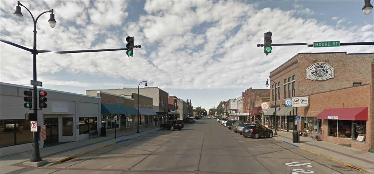
Let's take a look around together, shall we?
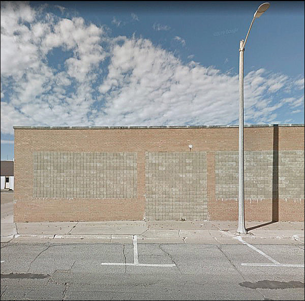
I’m sure they had a reason for this.
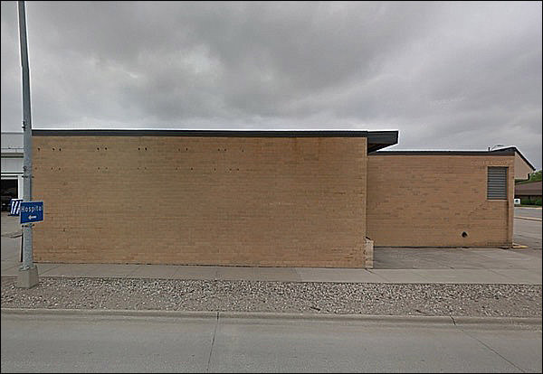
I’m sure they had a reason, too.
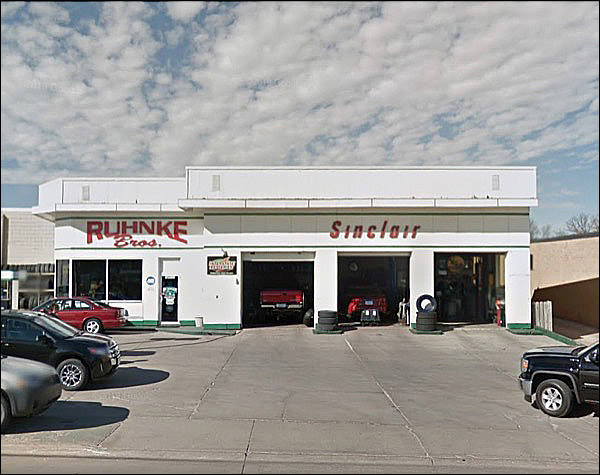
Ah ha: that’s original. Good ol’ Sinclair, the Dino brand. Always good to see they’re still around!
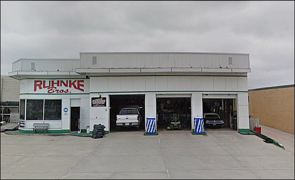
I spoke too soon.
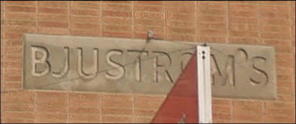
Four minutes of research located his profession.
He sold ice. Among other things.
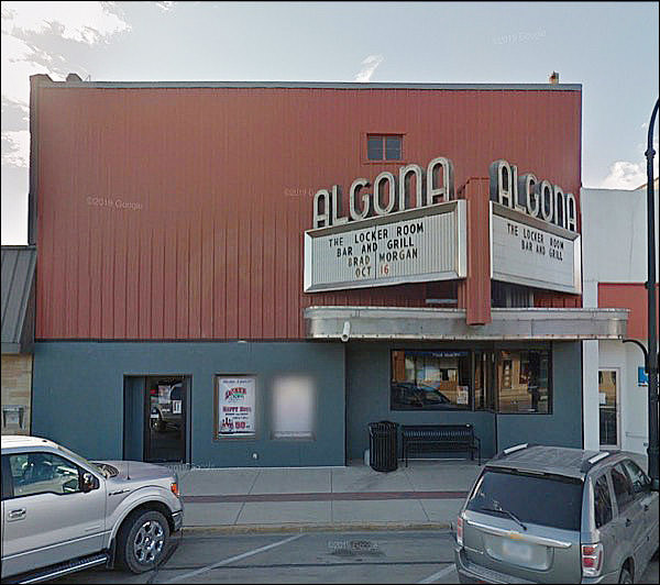
You wonder what it was like when it was first built, no? What facade might lurk beneath?
Nothing! That’s what it looked like when built, in 1951. The ads called it “The most fire-proof theater in Kossuth County,” which might have had something to do with its two predecessors burning down.
And another:
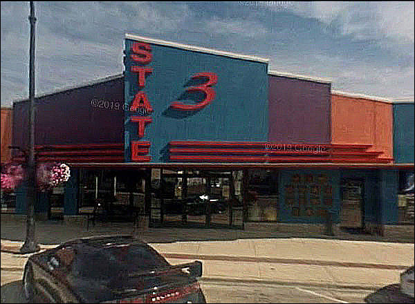
Cinematreasures says that “According to local residents, the State 3 Theater is in the former Ben Franklin.” Well, that's a journey.
Original design, unmodified?
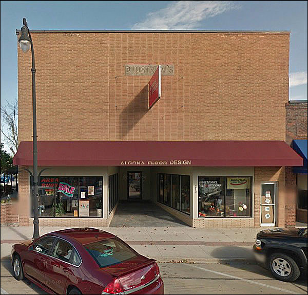
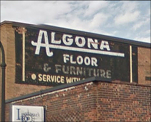
It was a furniture store. All towns of this size had a furniture store, named after the owner.
At some point the name changed, I surmise.
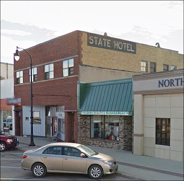
“I have a ticket to take this train to Algona. Do you know anything about it, conductor? Do they have a hotel?”
“Why yes, of course they do.”
Ah, the awning. Some towns incorporated these even if there wasn’t shopping-center competition. They had the unfortunate effect of making the second floor disconnected and superfluous.
This site says it’s not original, but was added in the 70s. Okay. Now it makes sense.
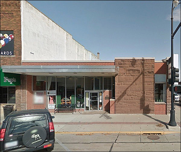
Extra modern! But . . . .
I fear they painted over that midcentury-modern brick.
“An addition will be a nice gift to downtown, sir. If I may suggest that the strong centering of your original building suggest a new facade, with distinctive -“
“Just copy it and redo it. I’ve already paid you for those plans."
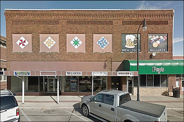
“I want the look of 1967 clip art, without the inevitable fading of paint that leads to a feeling of abandonment and decay.”
Looks like a nice little shrine, or just basic small-town civic improvement. Makes it look as if people around these parts care. They usually do.
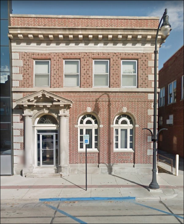
A perfect example of something that looks like a bank . . .
. . . but possibly wasn’t. But could’ve been.
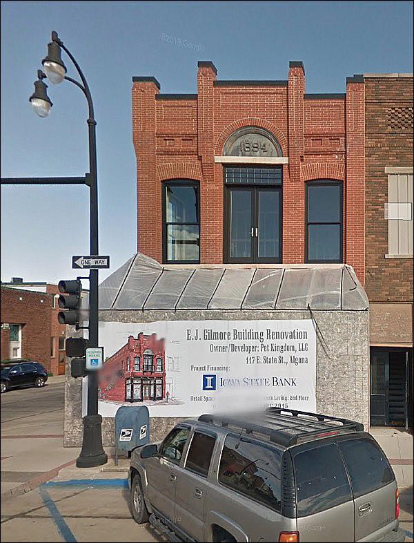
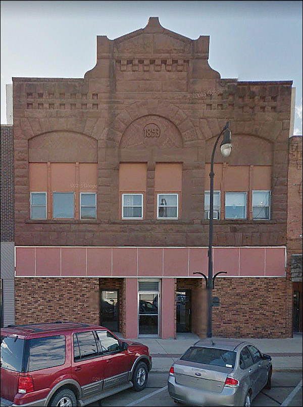
Now on its third century!
Seems rather resolute and unwelcoming, as if it has its forearms crossed on its chest. Then again, maybe it’s engaged in a stare-down with the town’s interloper.
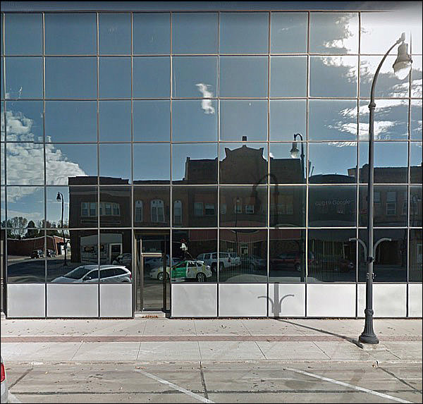
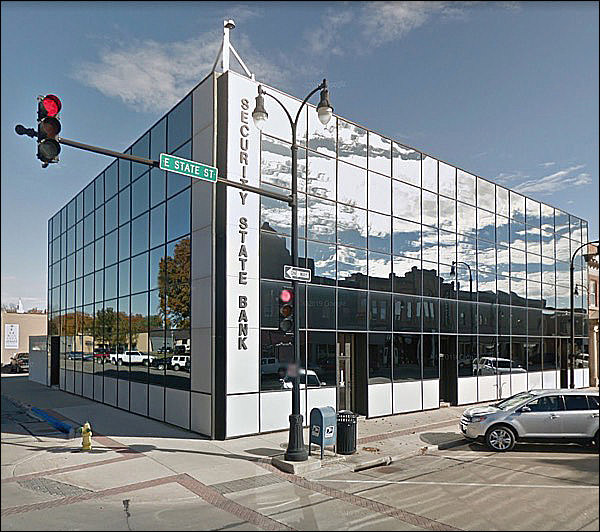
Skinned? Maybe. OUMB? Almost.
It has a 30s vibe and an 80s vibe and doesn’t really deserve either.
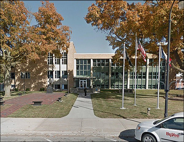
As mid-century as they get.
Complete with HyVee car! Yes, it's Iowa. Well, let's see . . . anything else?
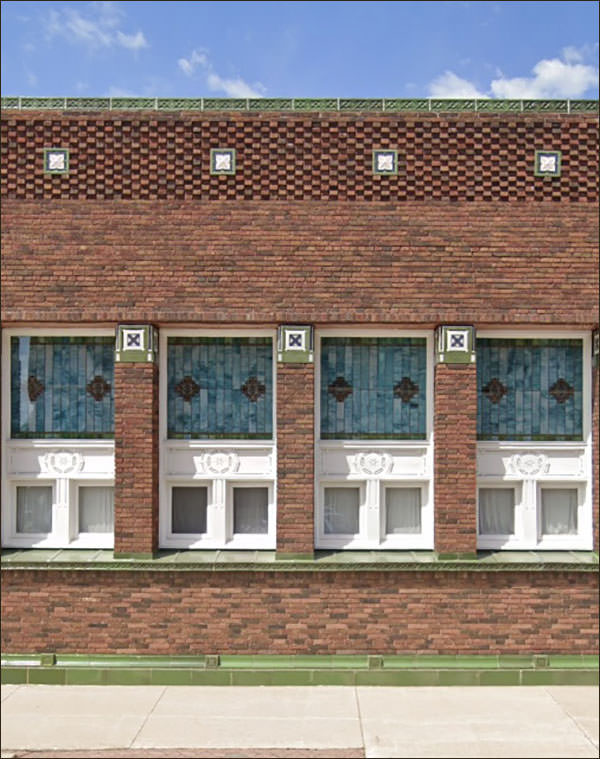
That's an unusual facade. What does the other side look like?
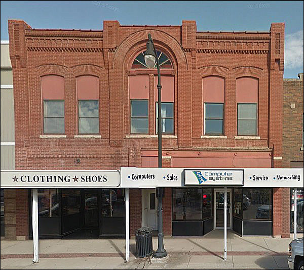
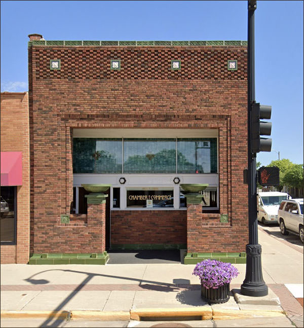
Yes, it's a Sullivan. 1912. He should have been doing big, soaring things. Instead he did small-town banks and office buildings.
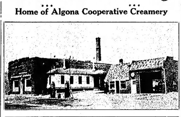
Oh RIGHT the Creamery. I completely forgot.
Couldn't find it.
|
 |
||||||||||||||||||||||||||||||||||||||||||||||||||||||||||||||||||||||
|
||||||||||||||||||||||||||||||||||||||||||||||||||||||||||||||||||||||||
 |
||||||||||||||||||||||||||||||||||||||||||||||||||||||||||||||||||||||||
 Almost fifty-five hundred souls. History:
