|
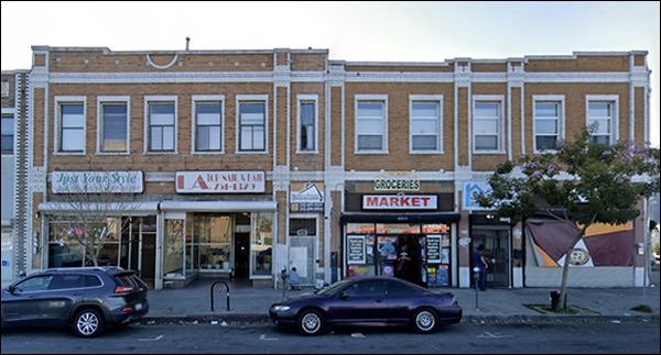
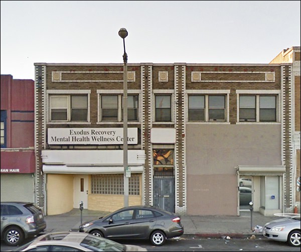
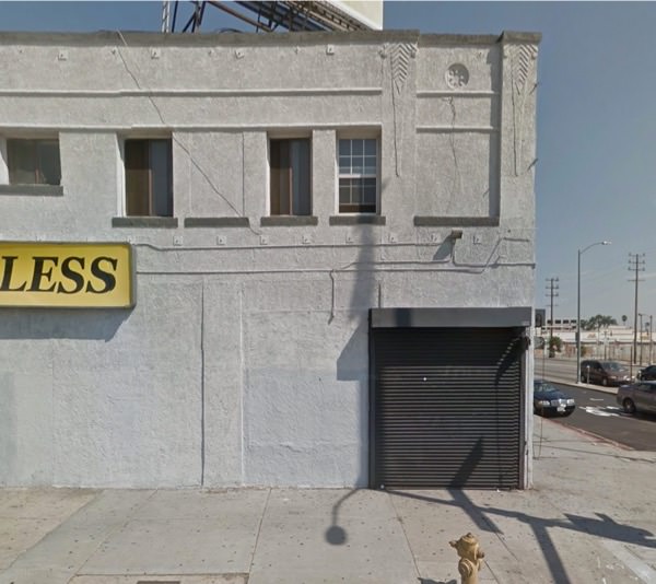
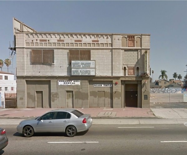
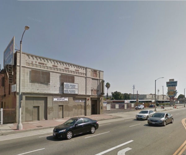
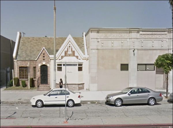
I have “Vernon Avenue” for this stretch of LA, but it seems to be half Manchester Avenue. Not sure it matters. It’s one of those scraped and battered old retail strips in the big city, a break from our small town stories. I cannot figure out what they were thinking with that roof.
You might think that a third floor had been removed, but the cornice seems to original. And it varies in elevation for obscure reasons. If it’s all one building built at the same time, why the asymmetry?
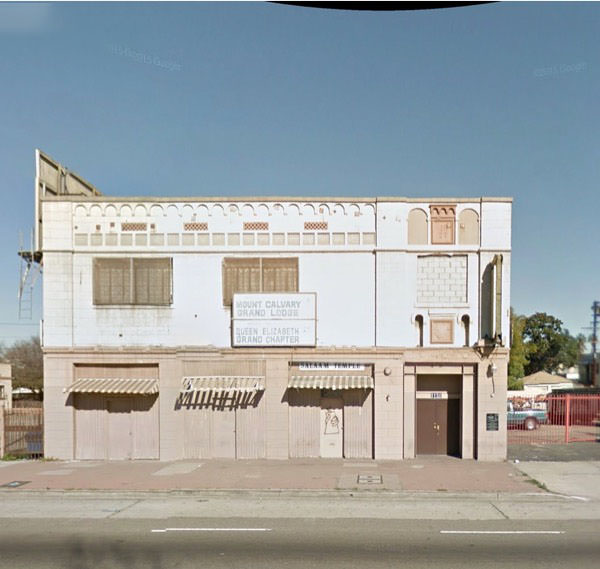
An older view . . .
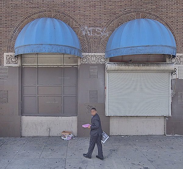
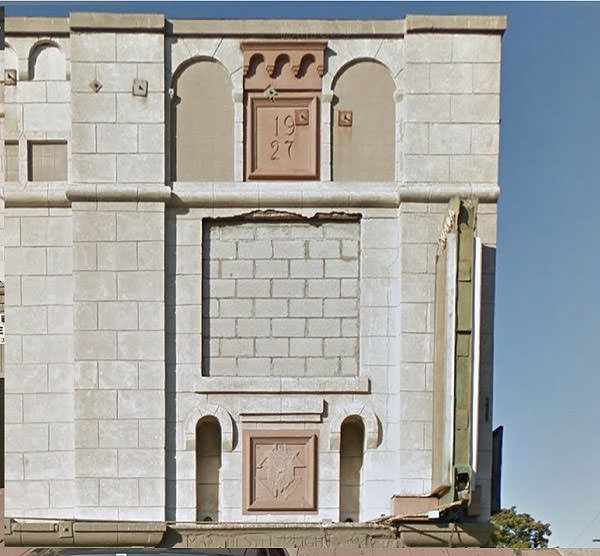
. . . giving way to something lesser, shuttered and unfriendly, with a few elegant carved capitals indicating better times.
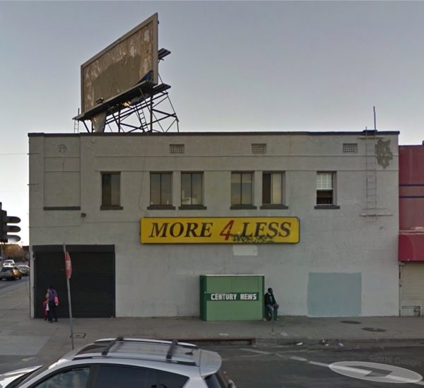
Well, I guess no burglars around here has any idea what a “ladder” might be.
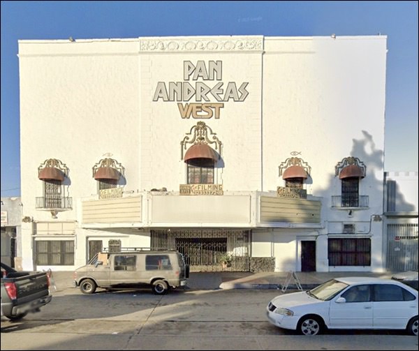
This poor, poor theater. At least they left some of the decoration on the cornice.
It was originally the Balboa. Cinematreasures says it’s now a collection of sound stages for filming. So there’s that. Better than the fate of most.
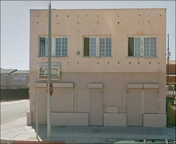
Modern enough to indicate the block was still in the pink in the 50s.
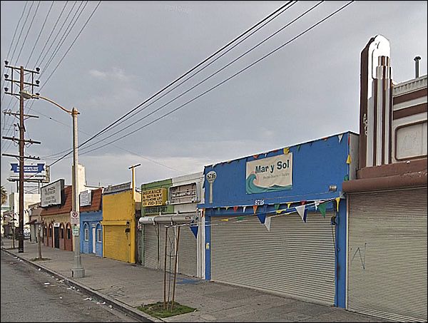
But close by, a row of shops that has to hail from the early days of LA.
Love that mast on the right, a piece of Moderne no one seems to prize.
How not to modernize a storefront, on the right.
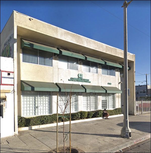
On the left, a reasonably acceptable version of the glass-block rehab. It’s okay. Doesn’t fit, but it really doesn’t fit any building unless it’s original. Doesn’t mean it’s not welcome. It just doesn’t fit.
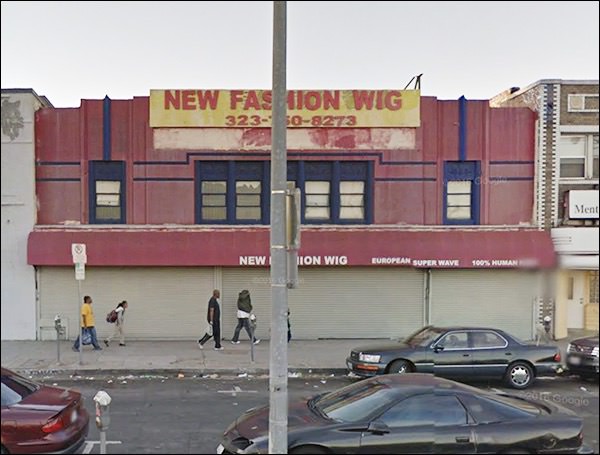
Another fine Moderne facade, ill-treated.
I think this is what drove me here in the first place, believe it or not.
I was looking through old LA papers, and saw some real estate news about new commercial structures. The ornamentation looked interesting, so I wanted to see if it was still around.
It's hanging on.
OUMB, from the California Spaceship style.
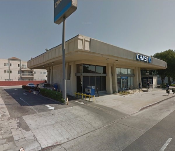
Could almost be a Ralph Rapson, with that emphasis on the top mass. I actually like this one; the angles help. Chase would be advised to let that roof line show itself, though.
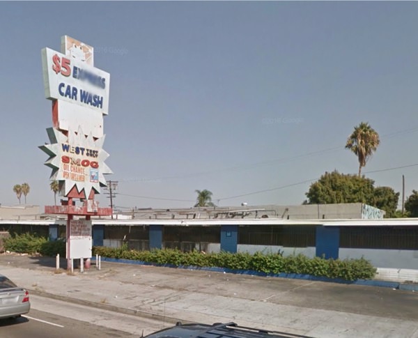
Classic 60s California, with a hard-times vibe. You know there was once neon and music drifting from the cars as they waited, or the bays where the employees worked.
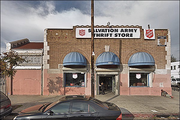
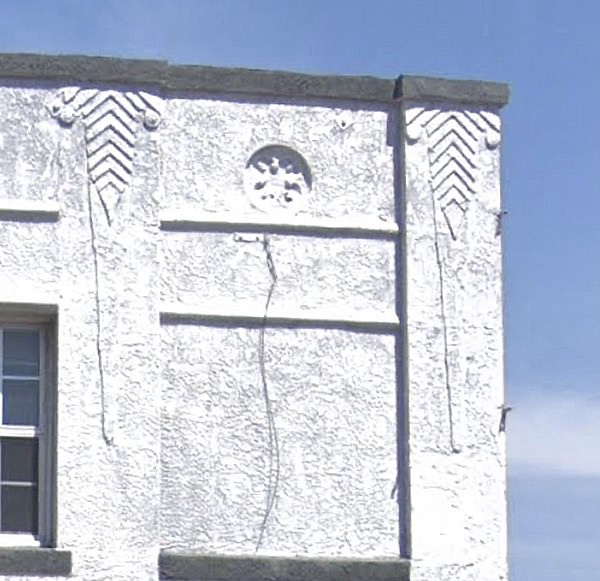
Another one of the commercial buildings I looked for. Spanish decorations in the finest style!
Earlier:
Close up: sigh.
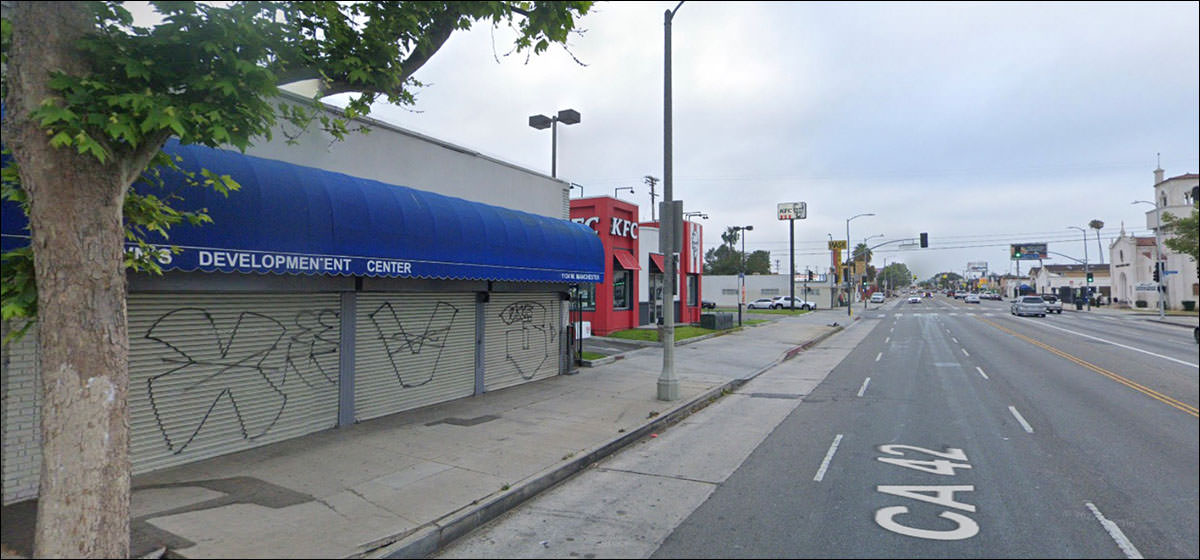
LA, where Spanish-themed buildings sat next to Space-Age signs for car washes.
And, of course, a HOUSE, just sitting there, somehow absorbed by its neighbor.
LA has endless stretches of streets like this. |
|


