|
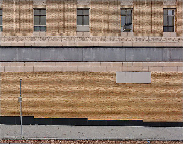
Well, they tried.
I mean, it has the bones of a classical building, but shows how they couldn’t come up with a new vernacular that didn’t reflect poorly on their inability to invent.
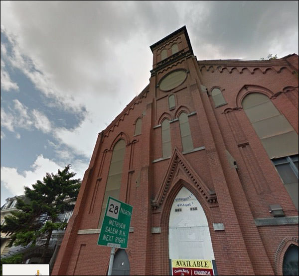
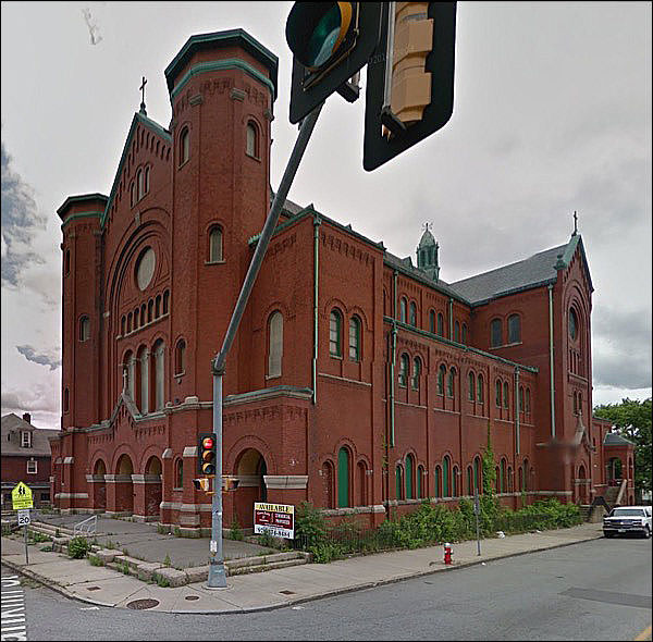
Ah, the old Empty Haunted Church. Let’s shoot a heavy-metal cover here! (Makes devil horns)
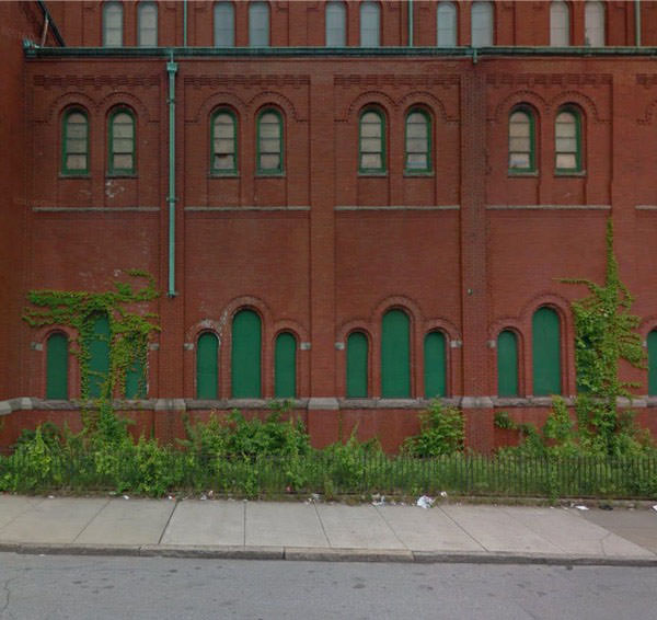
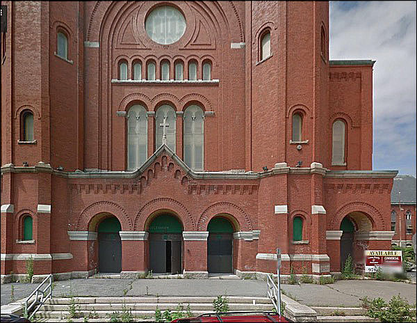
It's always strange to see a church that's gone out of business.
There aren't many new uses to which it can be adapted.
They usually go with "nightclub." What do you do with these?
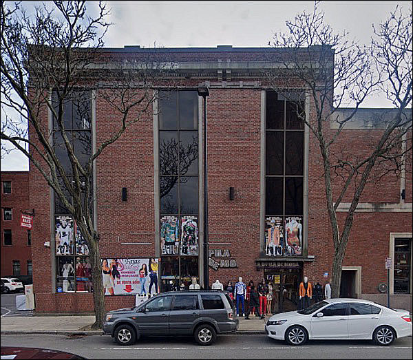
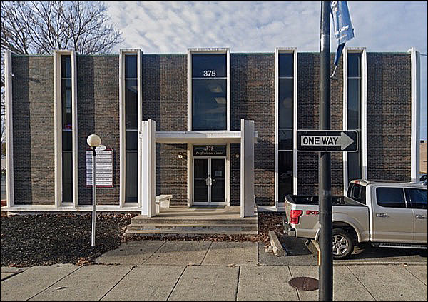
If you’re thinking this is a fairly modern building - last two decades of the 20th century
Well.
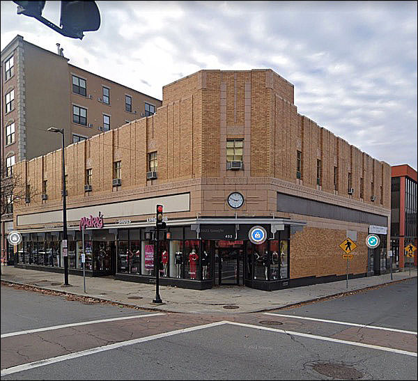
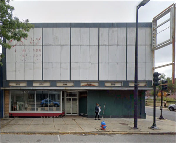
From the mostly forgotten era of . . . well, angular streamlining.
The 30s vogue had passed, and angles were back in style. The name would have gone here. I’m thinking . . .
Woolworths?
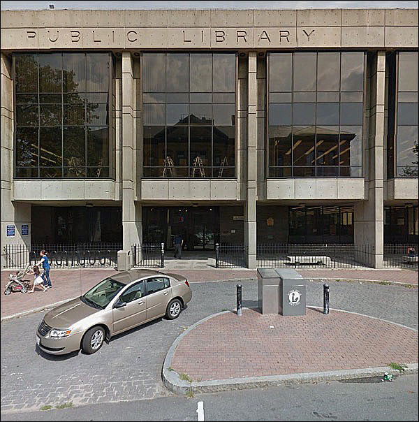
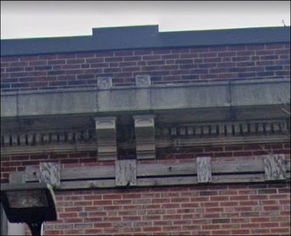
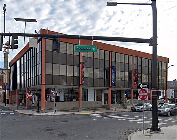
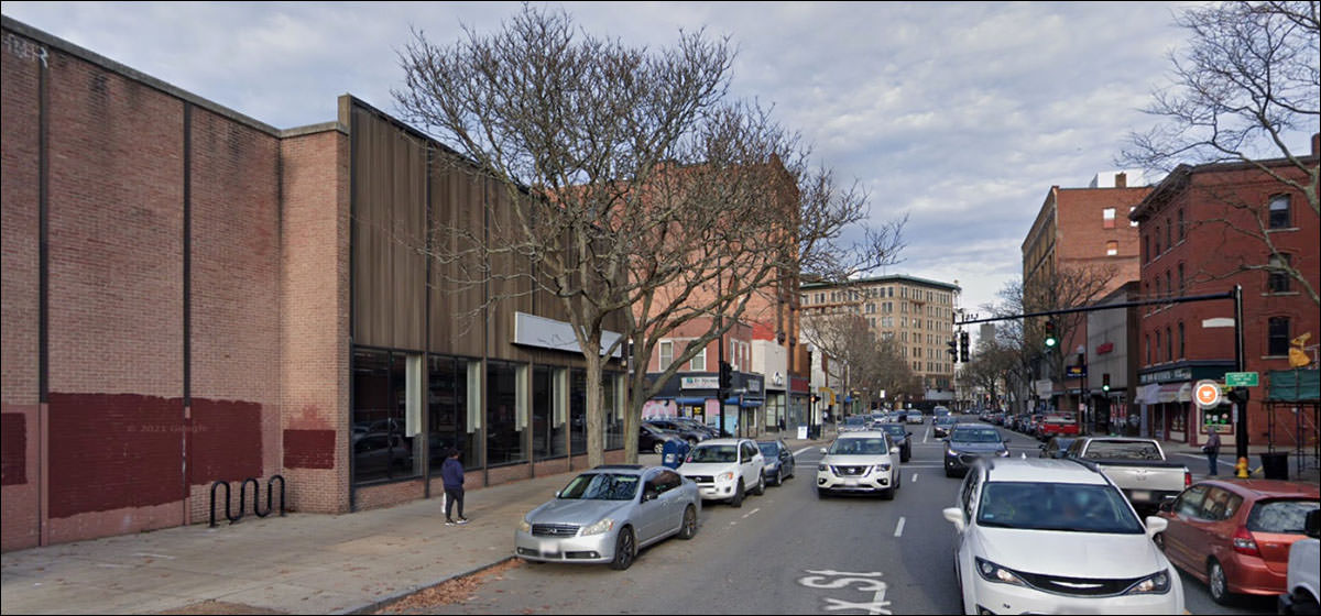
Oh 1960s civic / bank buildings, you never fail to fail to delight.
This one is almost entirely divorced from every possible style, even its own.
Future generations may look at these and think “were they okay? Was something wrong?”
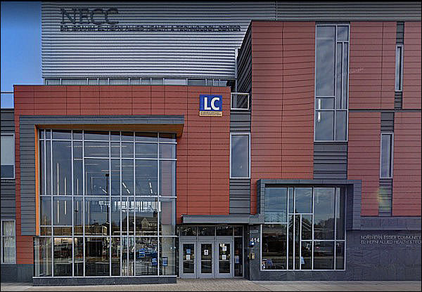
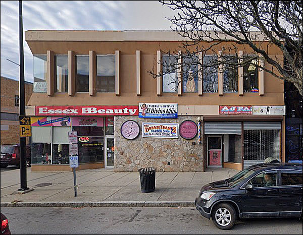
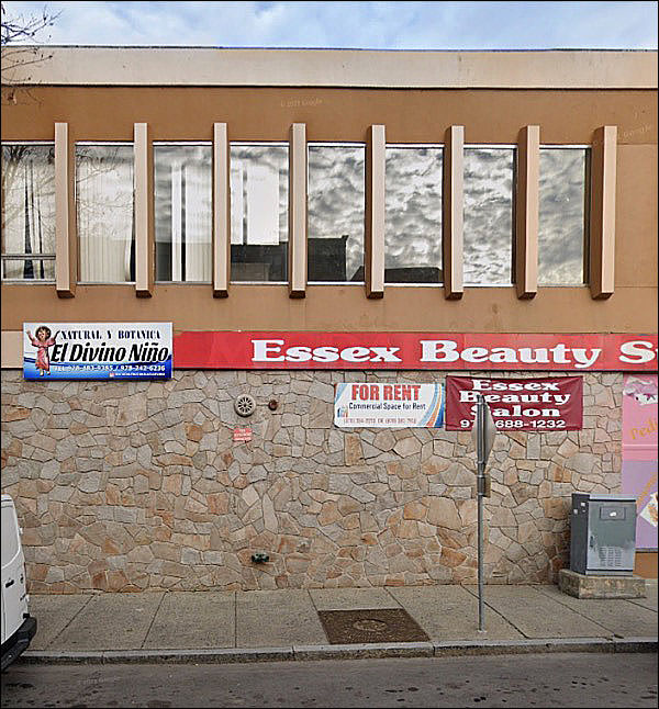
The garish phase of modernism, with its faux stone and strange new innovative additions.
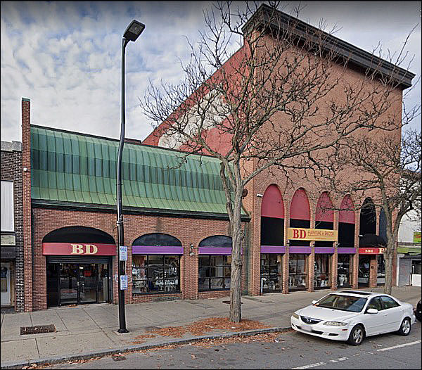
It’s come down a bit in the world.
The stone still adds swank, but the cheap signs take it away.
Beeeeeeyootiful.
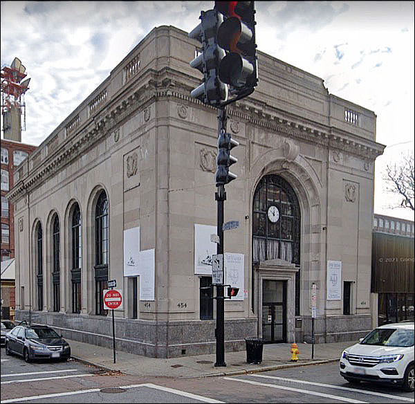
Even the most rote building of the style has heft and dignity. A downtown could have five of these, and a sixth would still be welcome.
On the other hand, they did have six of these, and the seventh was no more welcome than the fifth.
Maybe that’s too hard. It was a sign that the modern times had come to downtown, and that downtown was a going concern.
Oh, no. Just no, no. No.
The building on the right has had its face melted and the awful 70s arches installed; the one of the right has the oversized mansard roof of the time, but it’s recessed. Indented. Okay, that sets the stage. Next week: your hat! You should hold on to it.
|
|
 The first of two trips. Population 80K! Does that look like an 80K town? We'll see.
