
 |
|
Almost three thousand souls. Original name: Dallas. The residents didn't like it. Bethany was proposed, along with Carthage. Bethany sounded nicer. “I don’t care what folks say. I’m going to live there, and I’m going to make it look as much like a house as I can.”
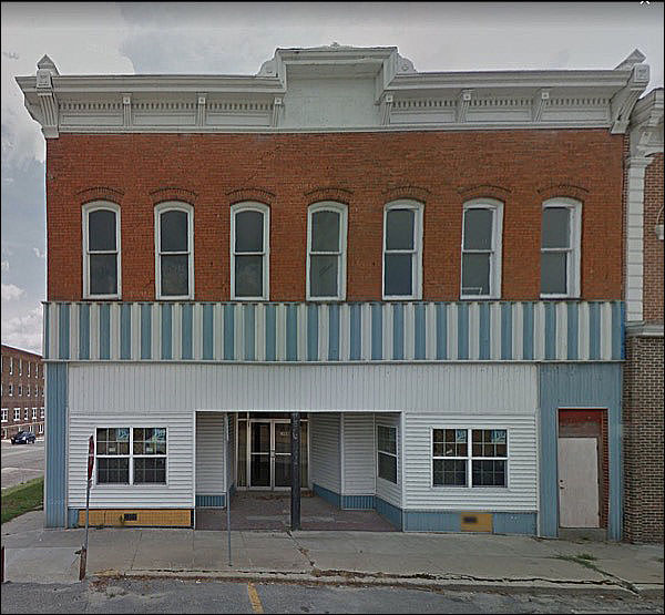
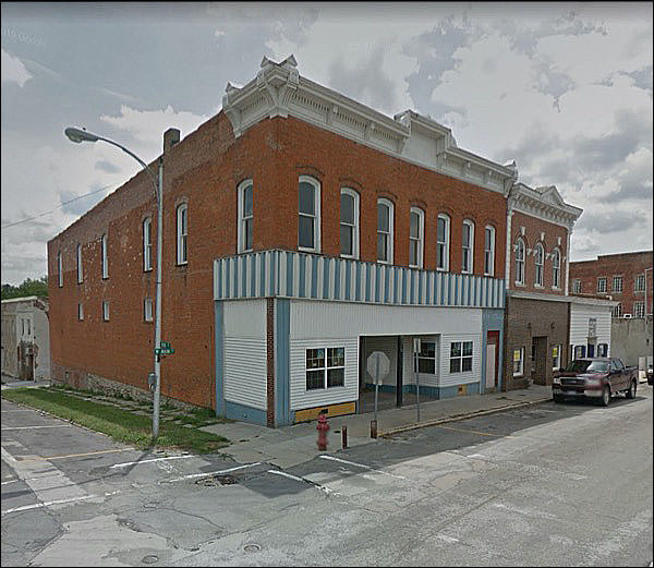
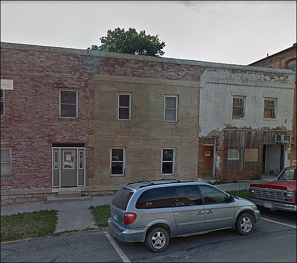
I feel bad for the building, for so many reasons. It’s wearing a mask.
Did it lose some cornice? Don’t think so; the corner portion terminates most definitively.
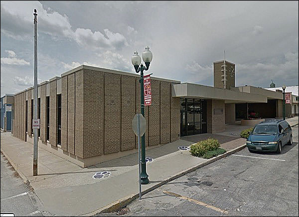
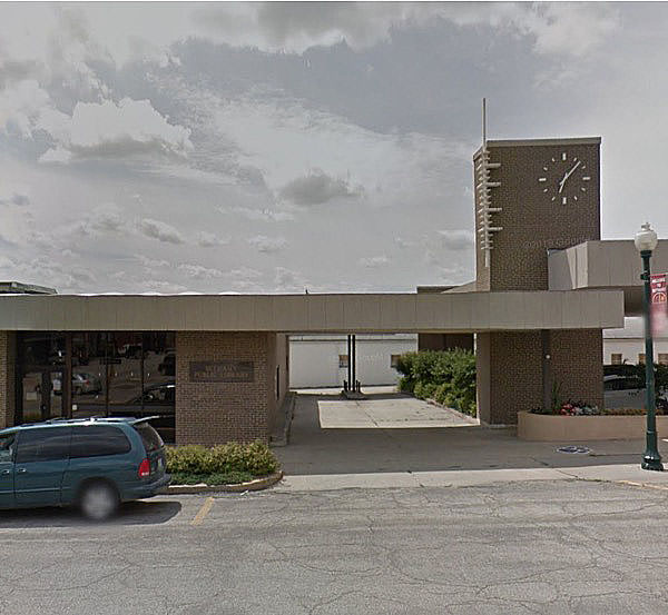
Borderline OUMB. You know I am partial to small-town mid-century modern, and . . .
This cinches the deal.
I don’t know if one building is digesting the other, or one is slowly taking over the larger one.
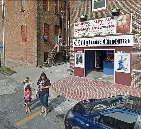
Most unobtrusive theater ever.
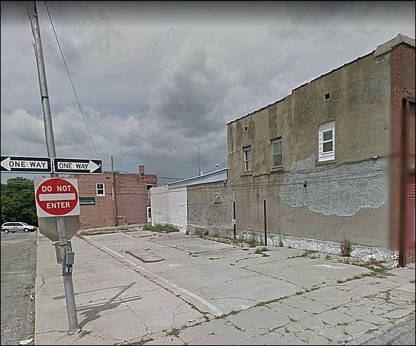
I don’t know why, but this shot makes me feel wistful, and a bit sad.
The sign was so confusing the building next to it self-detonated:
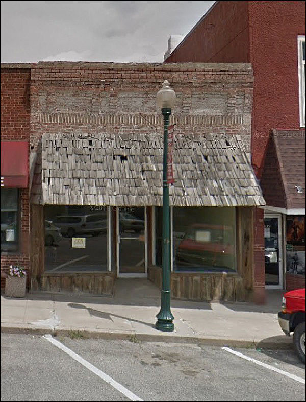
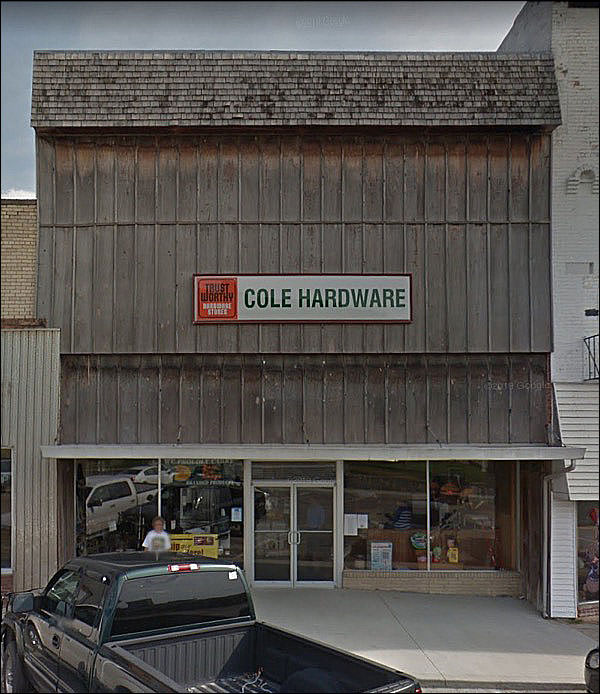
Almost a full Buckaroo.
Obligatory yearly note: that is not my term. I came across “Buckaroo Revival” used for the wood-and-shingles look, can’t find it, and now I fear that if I google it only my usage will come up. APOLOGIES TO ORIGINAL COINER. Playful rehab, which brings out the spirit. Of the top part, anyway.
The bottom is a post-war rehab. Something else was up there . . .
. . . but fewer and fewer recall what it was.
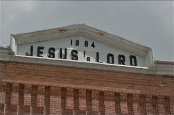
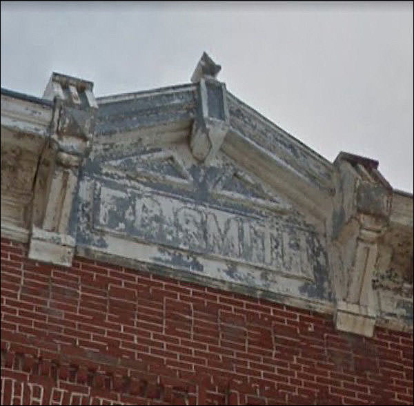
“So, Mr. developer, how exactly do you wish the space to depict your name? Just so we know what letters to order.” “THAT WOULD BE A VAIN AND PROUD THING TO DO.”
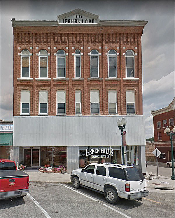
1884. I’ve never seen something like this before.
This site says it’s not original, but was added in the 70s. Okay. Now it makes sense.
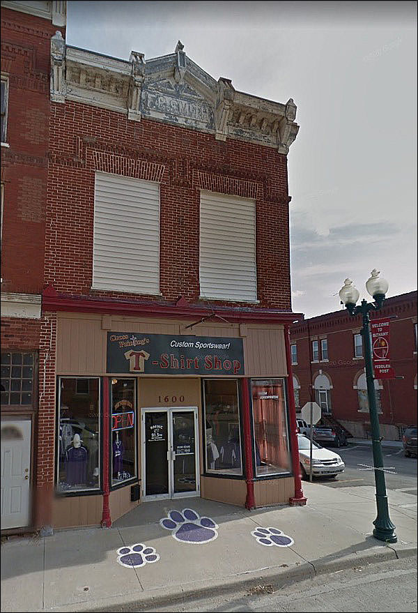
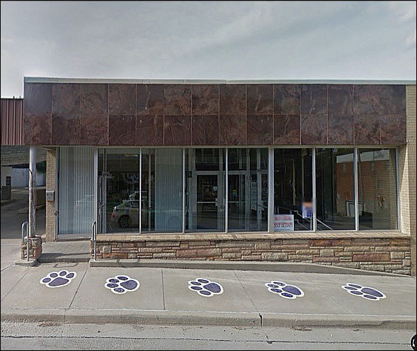
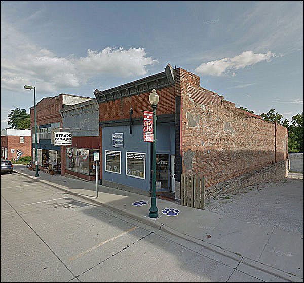
You may have noticed lots of these prints.
Must be booster week for the Bulldogs. F. C. SMITH
Originally a drug store, according to an old history page that turns up in Google but doesn’t seem accessible. . . . Ah. Still not much.
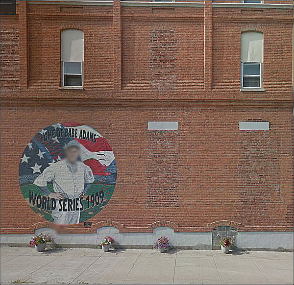
Good thing they blurred him out.
Looks like a nice little shrine, or just basic small-town civic improvement. Makes it look as if people around these parts care. They usually do.
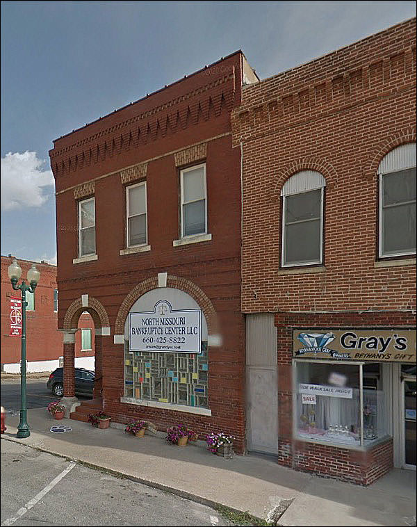
You know that was a bank.
Even if you didn’t see the hint of the drive-through.
Sometimes this gives you a feel for the age of a place . .
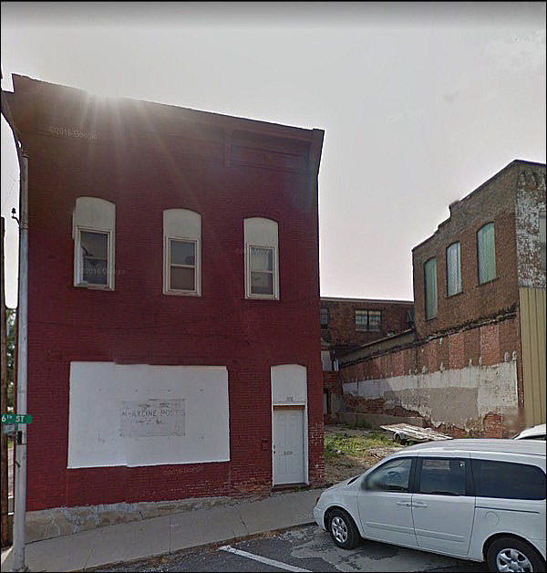
And sometimes the old, ordinary sense of slow decay.
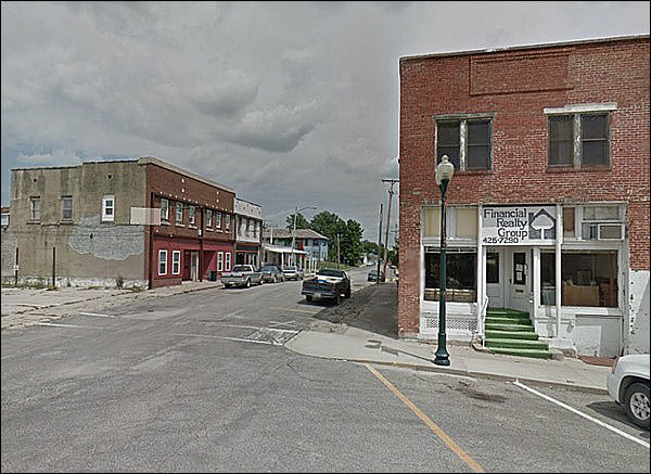
But the streetlights are nice, and the building looks rented.
They pay a lot of money in big cities to get that distressed look.
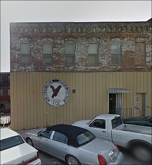
I’m sure the lads at the Eagle’s Nest thought it was an improvement; everyone did, back then.
Oh look, it’s a little diorama of Baltimore:
. . . and then this, a nicely maintained old bank with a Frank-Lloyd-Wright-style window.
WHICH OF COURSE IS PARTIALLY COVERED UP
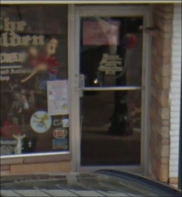
I can make out Shop, and no more.
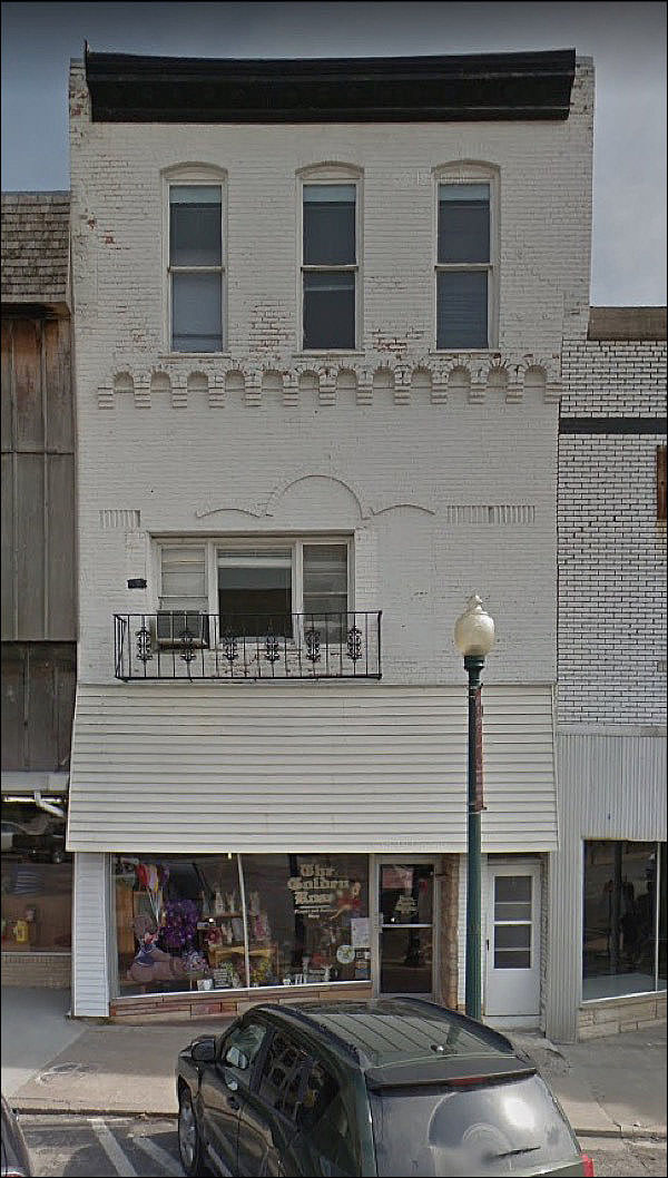
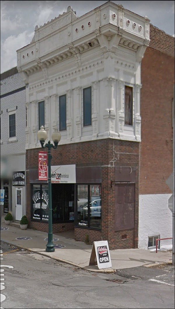
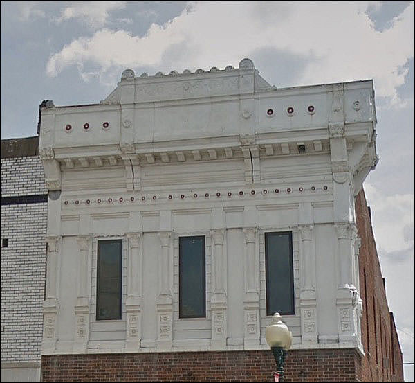
When they remade the small-town Main Street, they usually had no care for anything that wasn’t on the ground floor.
My God, what an Ogre
Oh no, no no
Ghastly from conception, I thnk. Nice 50s stone on the ground floor, though - you rarely see the vivid-hue variety these days.
Another utterly ill-advised knee-capping. Did the original offend sensibilities so much it had to be replaced with nothingness?
More off-centeredness.
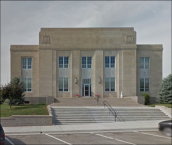
Finally, an WPA-Moderne number, solid and grave . . .
And just a leeeeetle bit under-proportioned.
|
 |
||||||||||||||||||||||||||||||||||||||||||||||||||||||||||||||||||||||||||||||||||||
|
|||||||||||||||||||||||||||||||||||||||||||||||||||||||||||||||||||||||||||||||||||||||
 |
|||||||||||||||||||||||||||||||||||||||||||||||||||||||||||||||||||||||||||||||||||||||

