

 |
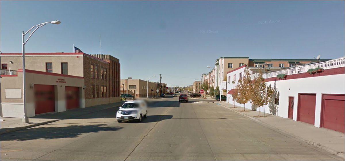
I’m surprised I haven’t been to Mandan in this feature. It was one of the second-tier NoDak towns when I was growing up (Fargo, Grand Forks, Bismark, and Minot being the top tier.) “We’d like a building that says ‘fire station’ but is not, in fact, a fire station.”
Did the entire state settle by a foot and a half? Or just a few inches?
Remember I spoke a while back about the vogue for painted store windows?
You know, sometimes painting the bricks works really well.
1906, with an addition in 1910. Historical district docs note that the Richardsonian arches were removed in 1926 and replaced with “Squared classical openings,” although it looks like it had a hint of Egyptian revival.
The ghastliness of this ground floor window renovation can not be understated.
It was a late 60s / early 70s thing, when all concepts of taste were bucket-brigaded out the window.
BANK. Please use our tiny basement windows for after-hour entry and robbery.
IN CASE THERE ARE ANY DOUBTS
Well, someone had a vision
Looks like a bucktooth moron rodent.
OUMB, with the spray-on facade.
Always a good sign when an old downtown gets new housing.
They may not be architecturally great, but it’s not as bad as the featureless buildings of the 50s, or the overly-mansarded flats of the 60s.
In case anyone decries modern apartments as boring and cookie-cutter:
Not entirely featureless, and better for the effort.
Wouldn’t be a medium-sized small town without an OUMB from the slit-window era.
The spare civic style needed firm, sure hands to keep it from being flabby and boring.
By which I mean this is flabby and boring.
t’s something you’d see in a 1954 Life magazine about the new look of the old small towns.
It's fresh and stark and interesting for a while, and then it looks as if everyone gave up trying.
“Bob, we can get the paint cheaper if we go in together and buy in bulk. With me?”
Interesting ground floor - the one on the left does not fit the building at all, but that style never did. Thin mid-century modern stone applied to the old buildings never cohered. The other building has awnings that indicate the storefronts disregard the original structure, and certainly clash with the upper floor. It could all use a good sandblasting.
A handsome old fellow from the prosperous days. Looks like an office building, but it was a hotel, built in 1917.
A handsome old fellow from the prosperous days. Looks like an office building, but it was a hotel, built in 1917. And today?
Our favorite Mexican Crime-Fighting Do-Gooder, Senior Housing!
A canvas this big, and they chose only to sign it.
I love this facade, but I think they could've done more. Then I think: no, it's right as it is. And then, no, they could've done more. Then: no, it's right. Repeat. No good answer.
Ladies and Gentlemen: Mandan, as we take our leave.
Yes, that made it to the Google Street View section. It's in there somewhere, or hasn't been uploaded yet.
|
 |
||||||||||||||||||||||||||||||||||||||||||||||||||||||||||||||||||||||||||||
|
||||||||||||||||||||||||||||||||||||||||||||||||||||||||||||||||||||||||||||||
 |