

 |
“The site is between two buildings. I really want my building to stand apart. Can you design something that will make a clear distinction between itself and its neighbors?” “Coming right up, Mr. Client.”
It’s not good. The top is awkward, there’s too much blank space - and to compound the sins, someone redid the shop front with 60s stone.
Here’s a muscular piece of work:
Good thing they blurred out the faces for privacy!
That’s not right.
From the same civilization:
That would be our OUMB, except . . . There's this.
And here's the apparently prison-inspired other side.
Busy, but lively, and still solid, like Fatty Arbuckle dancing.
I wonder if you could sgep out on the 4th floor. Doesn't seem so. Wonder why.
It’s just a hair on the NO side, I’m afraid. Could be a nice stripped-chic modern building, but’s lacking something.
“We could put the pillars on the ground floor, and -“
“No! People will lean against them, touch them, get them all dirty! Put them up where they will be pure forever.”
I’m not fond of this style, usually found in armories. Makes you wonder if they had a tank of oil for boiling.
“Well, yes, I did began with the strictest devotion to the principles of symmetry, but my mind wandered.
A beaut. And all-American! That was our style, and we were besotted by it for a while, until the classical forms made a brusque and complete reassertion.
The columns are the architectural equivalent of a participation trophy. At least you tried!
Without the marquee, you’d never suspect.
It’s the Jones. Lots of fine interior photos here, at, of course, cinema treasures. The story linked above said it was being renovated.
Kidventurezone doesn’t sound like a theater at all, not anymore.
It’s a bit much. It’s not scaled correctly. I’m not sure what style it wants to be. But I love it.
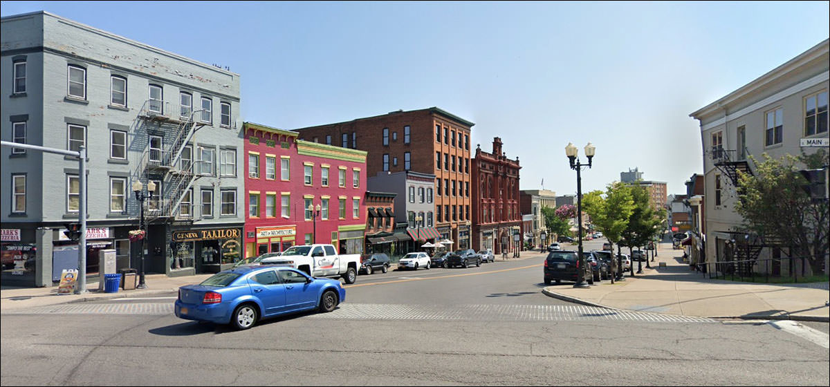
The classic American Main Street tableau.
Right down to the empty storefront and the ill-advised brick choices on the ground floor, alas. But upstairs? Beauty in the workaday world. Anyway, if I had to guess, I'd say Nursing Shoes.
|
 |
||||||||||||||||||||||||||||||||||||||||||||||||||||
|
||||||||||||||||||||||||||||||||||||||||||||||||||||||
 |