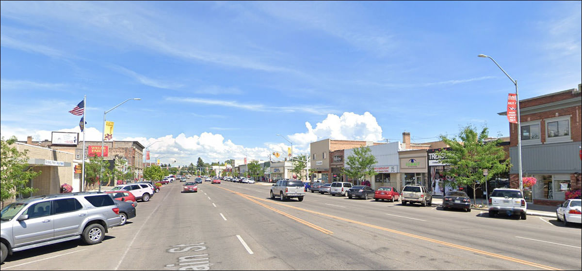


 |
What a nice place to begin:
Rather plain exterior, but the marquee pulls its weight. The side. Compare to this picture, which I think we can safely date to 1977.
Compare this to the early 20th century storefronts we’ve visited over the years.
Explain the logic. Explain the appeal.
So . . . OUMB? Or do I like it?
I like it. Always like the mid-century banks. Light and modern.
The good news: most of the original ground floor appears intact.
The bad news is rather obvious.
This one is rewarding no matter where you look.
The tile. The sidewalk lines. The sign on the corner post, blank and deteriorating. Dude’s been waiting for this moment for all of his life.
I’ll bet he has the pictures stored on his phone to show everyone.
It will be strange if the Google car goes back and he’s still there.
I wonder if they have? (No)
Nothing special; just a classic mixed-use structure put up with great hope and pride for the town.
“Say, I’m new in town and need to break some bones. Any suggestions?
That “Sled Shop” sign really brings back the Ed “Big Daddy Roth” era of typography.
I’m going with “DEPT. STORE”
“Do you have a room?”
“Yes, and it’s rented.”
Wow:
Literally.
What did it mean? You want to say “Workers of the World” but they went by IWW. No, it’s our old friend, the Woodmen of the World, the most Twin-Peaks association name ever.
Now we have an OUMB.
It's trying to make you think it's classical, with the arches and the negative spaces where columns would be.
Post Office, Library, City Hall, Courthouse: it was an infinitely applicable style.
|
 |
|||||||||||||||||||||||||||||||||||||||||||||||||||
|
|||||||||||||||||||||||||||||||||||||||||||||||||||||
 |