 |
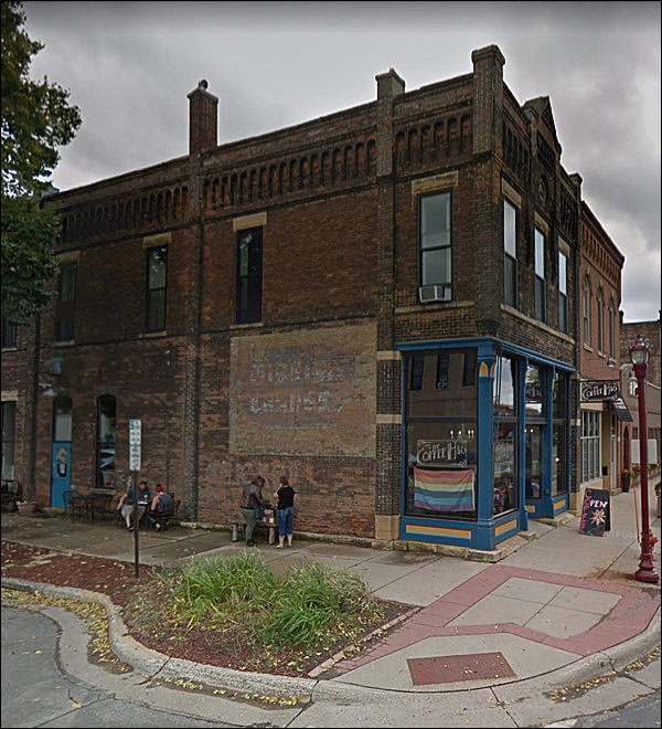
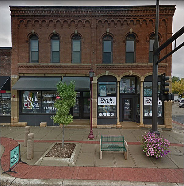
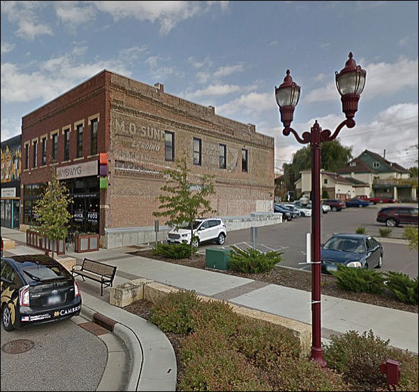
This is promising: There’s something perfectly Midwestern about this.
Ugly sidewalk work, though. The curb cuts used to be enough; now there’s a grate of raised metal nubbins so your feet can provide information to the blind.
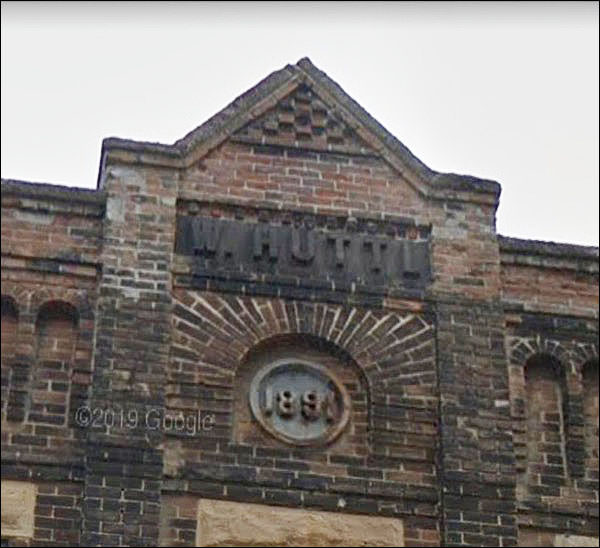
HUTTL:
That would be Wenzl Huttl - really - a tailor who immigrated from Austria. Married a local gal, who bore 14 children. FOURTEEN. There are still Huttls galore around the area, I’ll bet.
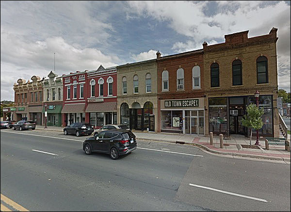
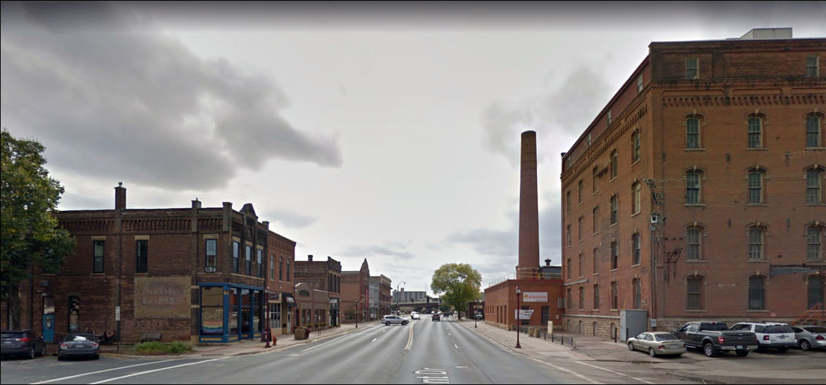
Look at this fine old street!
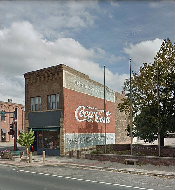
Don’t you wonder . . .
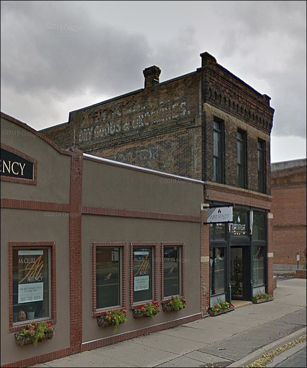
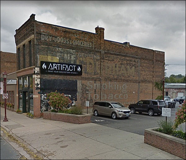
. . . whether the weathered sign was an homage to old times when it went up? Or has the lot next door been vacant forever?
Most honest store ever:
I wonder what explains the different storefront designs.
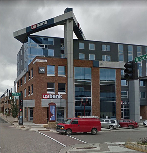
You have to think the architect of the latter building felt a touch of shame. The two-story building, however ragged and old, has better ideas than the modern one.
Actually, it has no ideas at all. Except “brick around the window!” Because brick lends dignity, I guess. On the other side:
One hell of a palimpsest. Probably had all the usual players over the course of time.
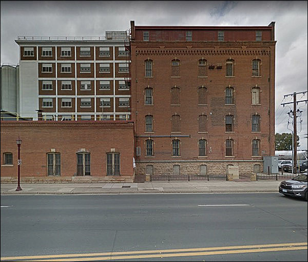
I think I just liked the composition on this view.
You can tell two things: the height of the building that’s gone, and the fact that Mr. Sunday’s ad buy preceded the owner’s desire to get some more air in this joint.
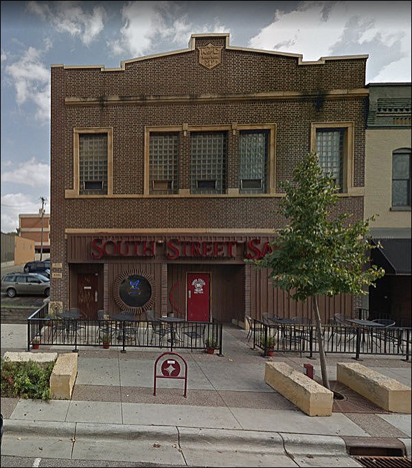
Fine building, cruel 70s groovy rehab.
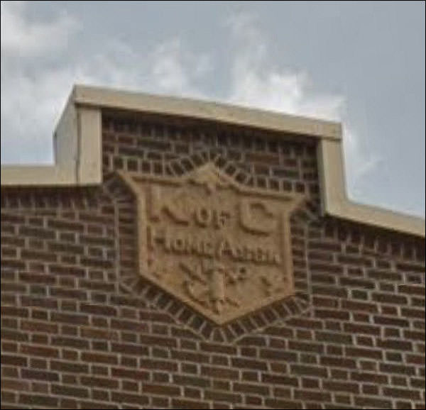
What’s the crest say?
I didn’t know they had a mortgage branch.
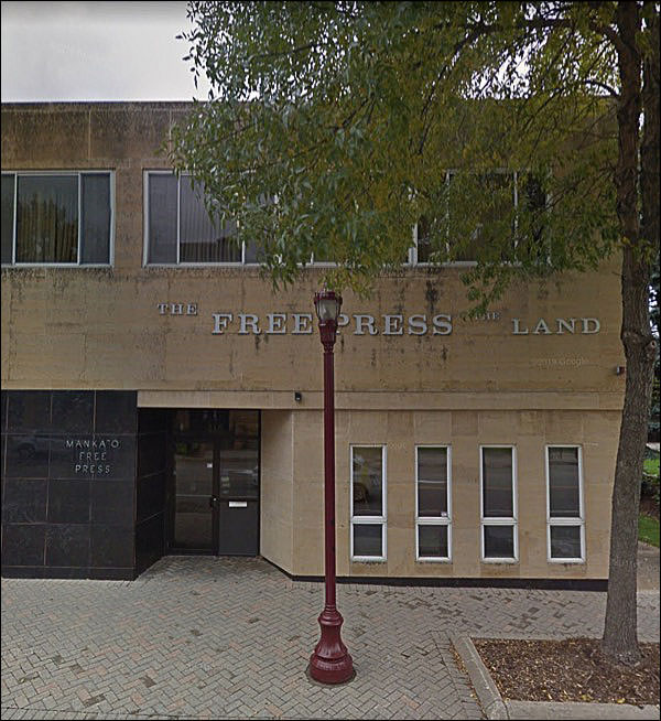
All newspaper offices built in the late 40s and early 50s seemed to look like this. At least around here. Kaasota Stone, no ornamentation - a journal of the people!
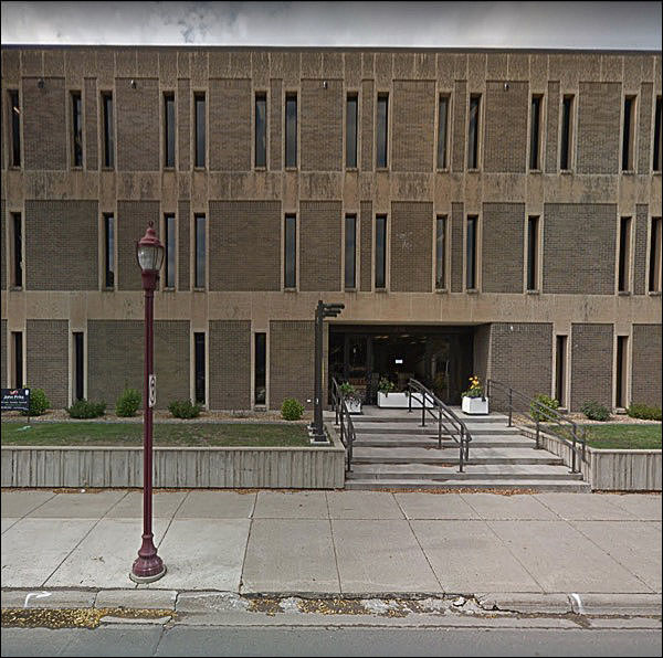
GAH Who in the name of God approved this terrifying thing? The era of punch-card windows was the worst thing to happen to buildings - and people, and cities - in note entire century of design.
Of course it’s a public building. Few private firms wanted this, unless it was a bank, and they liked it for other reasons.
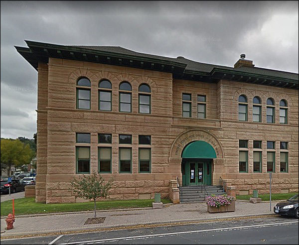
Why would you build something like the monster above, when you had lessons like this down the street?
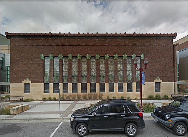
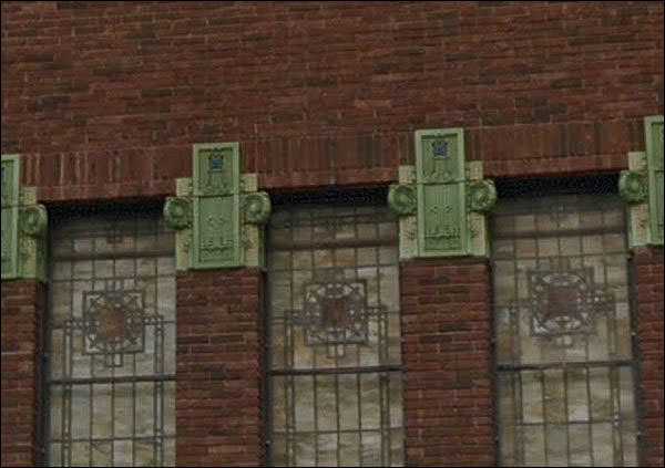
Or . . . like this?
The First National, a fine piece of Prairie school.
Oops. Love the whole thing,.
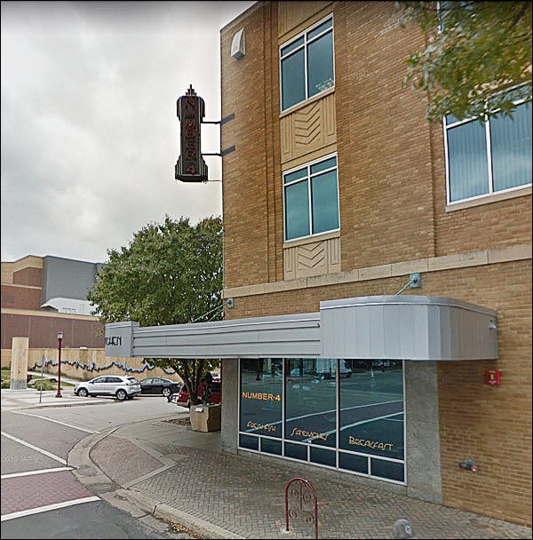
Meanwhile, nearby, we have a winner for the King of OUMB:
It has a certain whimsy to it, but this era of architecture didn’t age well. If you’re going to do something pointless, make it pleasing.
Let’s end now by stepping back eighty years.
|
 |
|||||||||||||||||||||||||||||||||||||||||||||||||||||||||
|
|||||||||||||||||||||||||||||||||||||||||||||||||||||||||||
 |
 Eighteen thousand five hundred souls in the 2010 census. What’s more, “Laurel is the principal city of a micropolitan statistical area named for it.”
