

 |
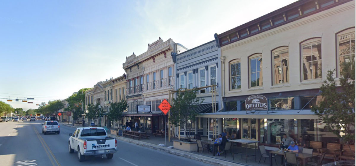
Their website says it’s “The Most Beautiful Town Square in Texas.” Let’s see if the boast holds up. These are not, I should note, the best photos; light was often off on the Google car’s trip. “Well, boys, we can put another story on top, or we can jack ‘er up and slide a story underneath.”
Justice, it seems, has turned her back to the supplicants.
“We have a lot of fine old architecture ‘round these parts. Or so they say. Ain’t seen none of it myself.”
Kidding; in the fall you can get a glimpse.
The Masonic Lodge. Much better picture, with its different colors, here. That’s a lot of tower, and not enough.
Twins, with different tastes in haberdashery.
Old man Evans has been in the ground for nigh on a century, but his landmark still stands.
The ornateness of this place is no small delight. It’s a window into a possible past, a time when most everything might have looked like this, if a town was prosperous enough.
See the little bristly bits on the cornice? All the buildings have them. Light bulbs. Looks fantastic at night.
Again: why hide these structures? This one looks as if it might have stories to tell.
P. H. DIMMIT
From the town’s historic website:
Has to be STROMBERG. And, lest we forget, HOFFMAN.
Subsequently rehabbed and turned into a restaurant, according to a 2016 newspaper story.
Maybe just go upstairs and open up a window? Oh right there aren’t any
Legend says she never forgave them for losing her money in the panic, and showed up every day to stare at them until they gave it back.
It’s impressive and lovely . . . but then you study the facade, and it starts to hurt.
If you like symmetry, that is. One phase? Two? Three?
Now on its third century:
M. B. LOCKETT. Dry goods merchant, and from the looks of it, a prosperous one.
OUMB.
The apron is just . . . unforgivable.
A Rapsonesque overhang, typical for the era; really made a building soar, didn’t it.
Heavy, overscaled roof resting on slender columns - over and over they did that design.
|
 |
|||||||||||||||||||||||||||||||||||||||||||||||||||
|
|||||||||||||||||||||||||||||||||||||||||||||||||||||
 |