

 |
For some reason I always dislike these.
Don’t remind me what you wrecked.
I always associate these with furniture stores, for some reason.
The corner had a sign, once. Next door, the name block provides a reminder that Mr. HOGE walked this earth, and left something behinds.
A noble old citizen . . .
. . . now housing a XXX video store. In related news: there are still XXX video stores.
Hard life for this one, and a question:
Nevermind the stuff stripped off the front and rebricked with no eye towards consistency. What was the use of the big door on the side? Did it connect to the building that’s now gone?
This looked nicer, once; the front door had some severe but artistic intentions. Now mostly lost to general shabbiness.
Why did I clip this?
Ohhhh
Late-stage modernism: they were taking liberties with the box, and doing daring things. Like angles!
Adding three stories on the left made the original windows seem bunched up.
Drapes in the front window: never a good sign.
Ah! That’s more like it.
That’s beautiful. Completely ordinary for the era, too. Oh the days when beauty was not only expected, but rather easy to accomplish.
Was it so hot inside they had to install a massive AC unit to keep people from dying?
Maybe just go upstairs and open up a window? Oh right there aren’t any
I am truthful when I say I’ve never seen this. Glass block on a bay window.
I hadn’t seen this when I made the furniture remark above.
A sign of long tenancy, and confidence.
LAUGHLIN
I believe that lovely storefront is original. I don’t know why there are dots all over the terra cotta, unless they glued on a metal facade in the 50s. Entirely possible.
Every downtown needs one of these to add Depression Moderne to their catalog of building styles.
It helps if there’s something inside, of course.
Someone took the sober old banker and made him wear a frilly tutu:
I understand that downtowns needed to modernize to stay relevant in the post-war era, but this is just embarrassing. It doesn’t work and it’s an affront to the original structure, and an indictment of modern tastes. The google street view is somewhat hallucinatory.
“We want a classical-styled building, but we’d also like to forget what it was when it gets to the fourth floor, and just ends up being a strange array of nothingness.” “Can do”
McKEE:
Again, it’s rote - but nice. The windows look original. The ground floor has that 80s rehab look. They thought they were being classical. Perhaps that’s all they could muster.
Ah, the Xargonian Embassy, erected when relations between our two worlds was warm and friendly:
The upper floor is so serenely restrained I wouldn’t be surprised if the ground floor was original.
But something nags me, and says it’s not. It came later. Not a long time later, but later.
“We can’t figure out why people seem to instinctively shy away from downtown these days. There has to be a reason, but what?
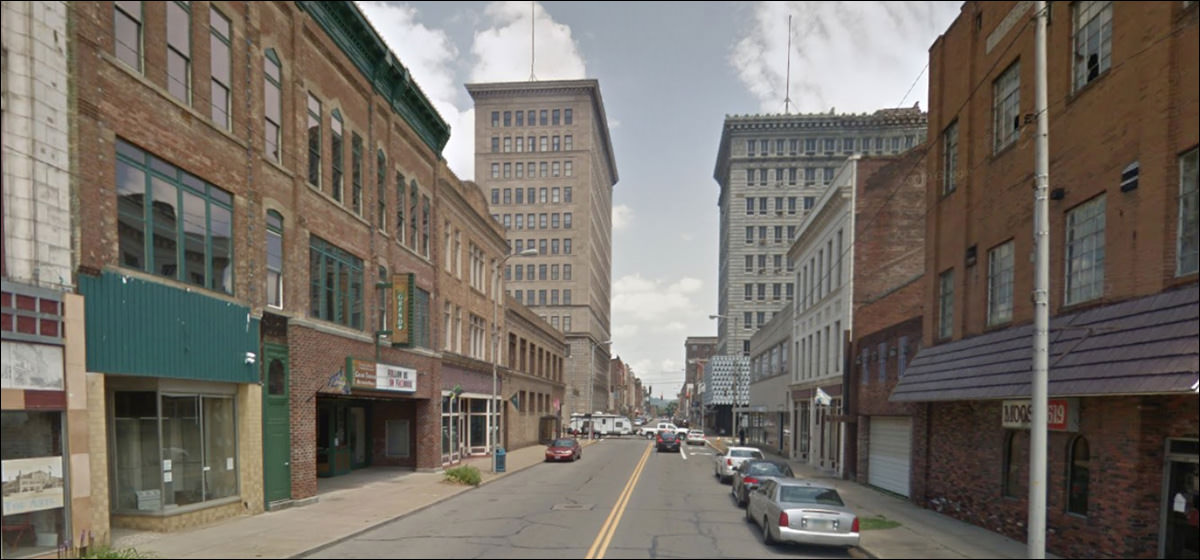
The classic vista, the sign of a fine town on the move, thrusting up, growing out, providing every service the townspeople require.
Except there don’t seem to be any townspeople around, anywhere, ever, at all.
|
 |
||||||||||||||||||||||||||||||||||||||||||||||||||||||||||||||||||||||
|
||||||||||||||||||||||||||||||||||||||||||||||||||||||||||||||||||||||||
 |