

 |
 |
|||||||||||||||||||||||||||||||||||||||||||||||||||||||||||||||||||||||||||||||||||||
Perhaps clear the decks for the rest of the day, because this one is long.I just couldn’t stop. There was so much. Doesn’t seem like it at first, you might think.
So what? It’s the lettering. The modern style of the building, the lettering - this is high mid-century chic. It is, shall we say, an outlier.
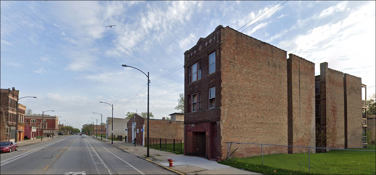
Some buildings look as if they’re begging you to let them collapse.
As the glaciers receded, they revealed the ancient forms that had been buried for centuries:
A bit later:
There was a time when this looked unusual. Now we're used to it.
don’t know what makes people choose that type of facade. As I’ve called it before, it’s the Elephant Man’s Disease style of bricks.
Seems popular with the storefront churches:
“Did you check to see if everyone was out of the second floor before you bricked up the door?”
“Ahh, they can get out the window.”
Beautiful!
But that window used to be plate glass, showing nice things to entice the customers.
I get the feeling that people around these parts are serious about religion, don’t you?
A sign of what this modest retail strip looked like in the 20s; lots of small, compact buildings with minor “historical” touches that anchored them in the culture, somehow.
An old man, his friends gone:
Off-the-shelf Prairie-style ornamentation
The right-hand corner suggests the 30s. What was behind the big glass window?
Like a Roman ruin in a recently excavated archeological site, or something that survived the fall and was put to other use by the locals.
Ghost sign.
Gleaming white for the new era of prosperity, with those cartouches to show they’d spent a few bucks on this one.
Wow:
The problem, if there is one, and there is, arises from the lightness of the ground floor, which seems insufficient to carry the weight of the heavily-ornamented second.
Here’s a building that wished it had such a problem.
Back to the storefront churches, which are oddly uninviting.
This was once a building of considerable elegance:
A lone detail to suggest what it all was, once.
Remember: this was an ordinary street in a big city. It wasn’t the main drag, the high-society hotspot. When you built something in the flush times, you made it special.
Probably visual gibberish to someone born in 2001.
There are so many.
You get the sense that the taller building should have another wing, but that’s not possible.
It’s a retrofit. An old store bricked up, with a pediment added after it had a new purpose. I think.
Finally, one of the reasons for all the churches:
|
||||||||||||||||||||||||||||||||||||||||||||||||||||||||||||||||||||||||||||||||||||||
 |