 |
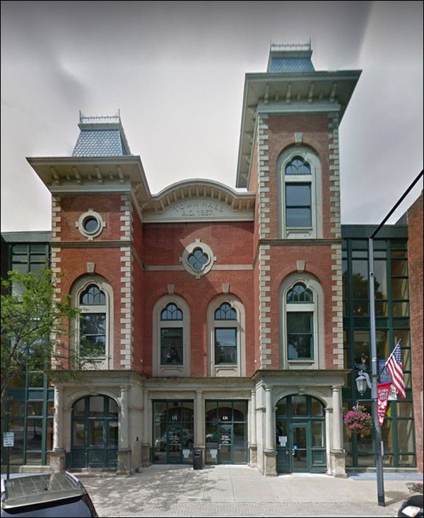
We wish them luck. Let's see what downtown looks like. “Maybe we shouldn’t build this one out of oil-soaked timbers like the last four.”
Is there any name less impressive?
When you apply your paint with a firehose:
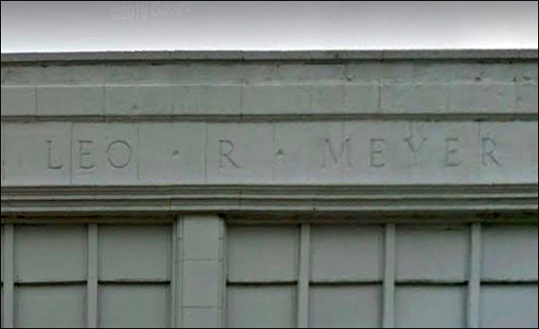
LEO R. MEYER
He was a prosperous car dealer and local capitalist of no small accomplishments. “It’s my most brilliant optical illusion ever. By angling the window down, it appears that the entire second and third floor project outward like a bay window.”
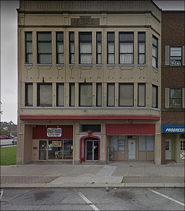
FOE, and you know what that means by now.
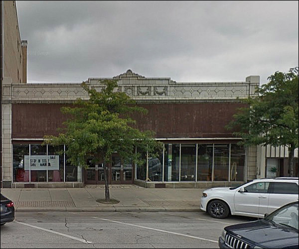
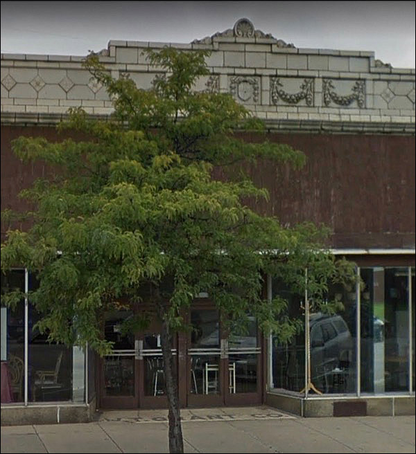
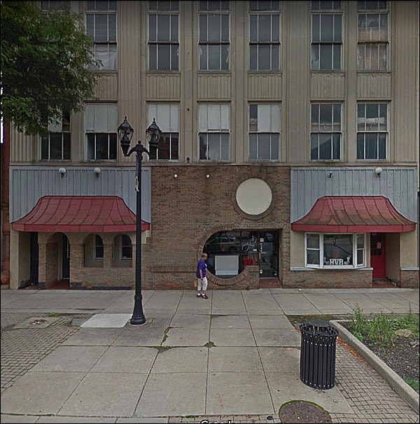
What the woody space once looked like, who knows - but we can guess from the nice terra-cotta around it.
W. T. Grant, the fabled and ill-fated variety store.
WOW
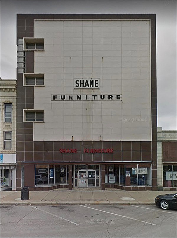
Don’t think Shane had the scratch to do the facade justice once he took it over.
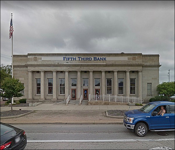
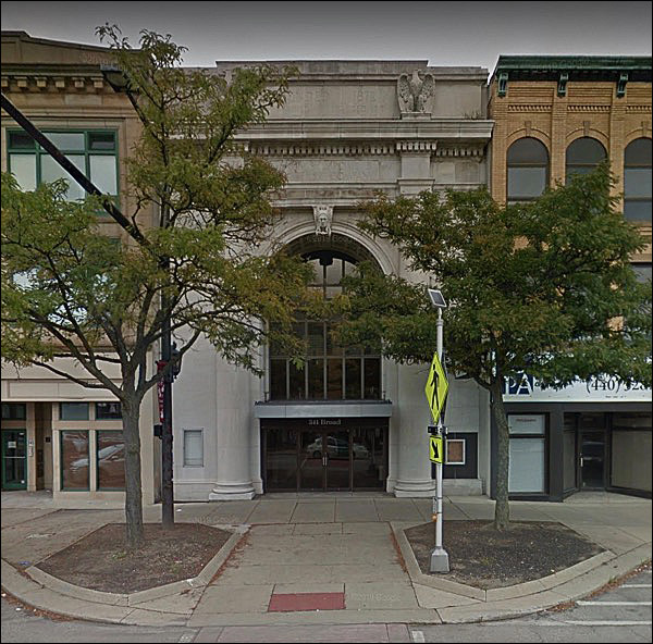
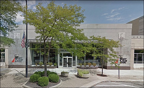
Lovely way to frame an old bank:
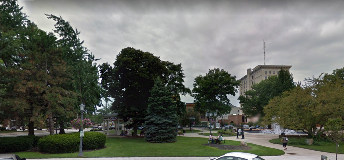
You know how I feel about trees downtown - best used sparingly - but this is a nice job, shady and civilized.
I’m going to go out on a limb and say there’s a more interesting brick facade underneath.
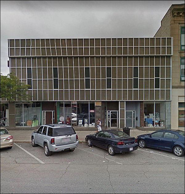
The seldom-lamented school of punchcard architecture.
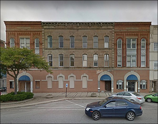
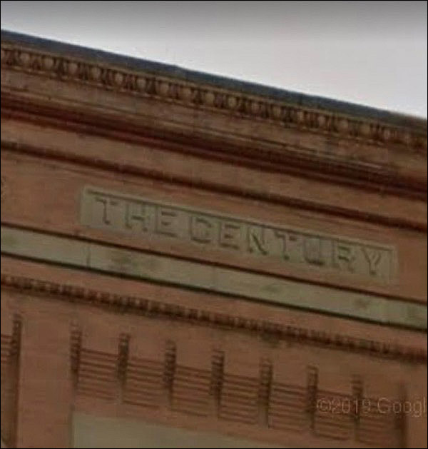
Oh, this hurts. The one in the middle is the Henry Mussey block; he sold stone. The others are called THE CENTURY.
The buildings on the end have the middle portion surrounded! The ground floor attempts to tie them together, and screws up the proportions and balance. Clone-stamp-tool arches - and those poor little projecting bays set in deep niches.
THE Century. The new one.
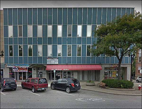
Architectural depravity of the sort you only got in the 70s and early 80s. Tin-eared, tone-deaf, arrogant, faddish.
Looks like the rest of the building isn’t exactly overflowing with tenants, either.
“You met my brother? He’s up the street. Wears brown.”
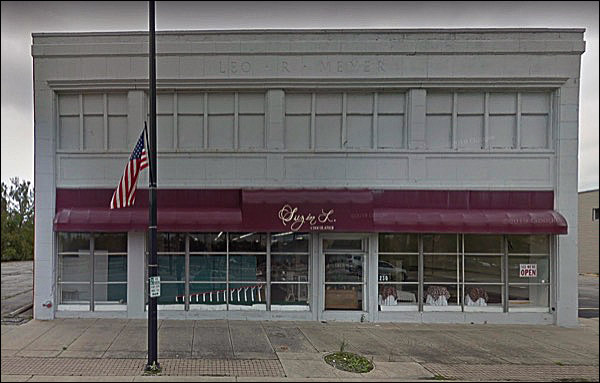
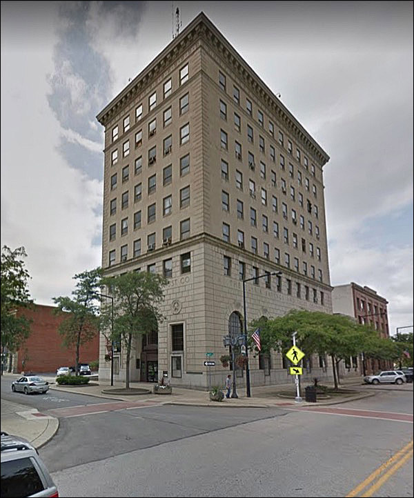
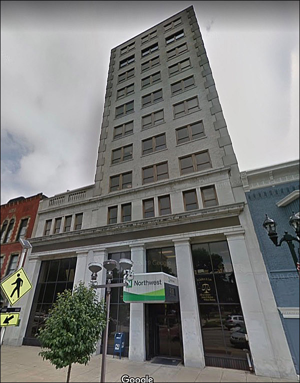
The first few decades of the 20th century deposited buildings like this all over the country. They varied by a few stories, the amount of decoration, the cornice, but they were all this building.
And that’s good!
Nice visual representation of a city that intends to thrive and grow:
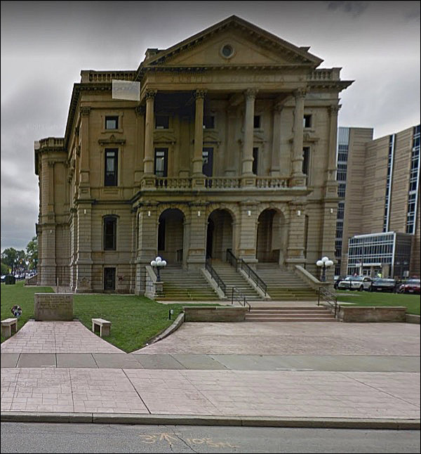
Another one of those peculiar temples that’s jacked up on blocks, but there were classical precedents for this.
That’s a rather uninspired effort.
But when ornamental encrustation had become baroque, something like this was a sign of clean clear times to come.
Finally, a bank of smaller proportions.
I’d say it was the Cutler National Bank, but who’d get the reference?
|
 |
|||||||||||||||||||||||||||||||||||||||||||||||||||||||||
|
|||||||||||||||||||||||||||||||||||||||||||||||||||||||||||
 |
 Fifty-four thousand souls, which to me always means "Fargo sized." Wikipedia's entry is written with
