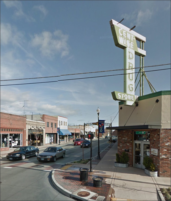
A perfect example of a sign that exceeds the style of the facade:
That wretched mixed-brick look had a brief vogue, and we should be lucky it didn't infect too many structures. As for the sign, a Google search reverals that it was also a sporting-goods store. And that it's closed now.
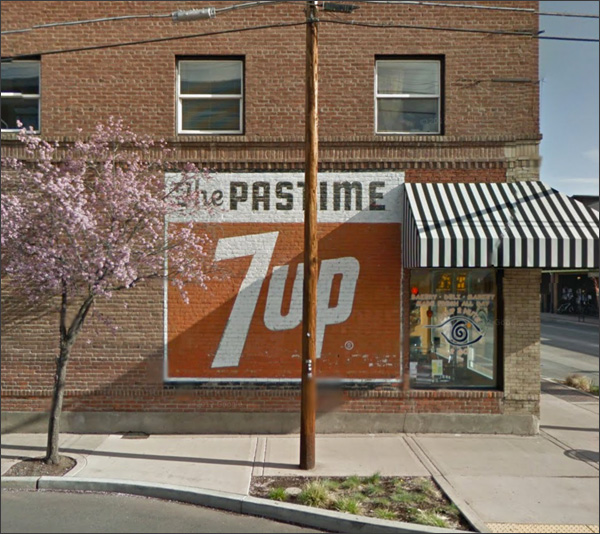
Someone knows the virtue of a classic downtown painted sign, and the wisdom of keeping it maintained:
It was a hobby shop. Annnnd it's closed. Anything classic in Redmond that's still a going concern?
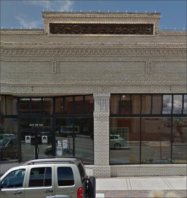
Lynch & Roberts:
From its historical plaque:
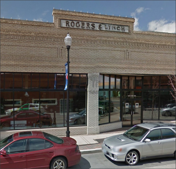
Second floor not feasible, eh? Someone skimped on the foundation. From a story about the partners:
Indeed:
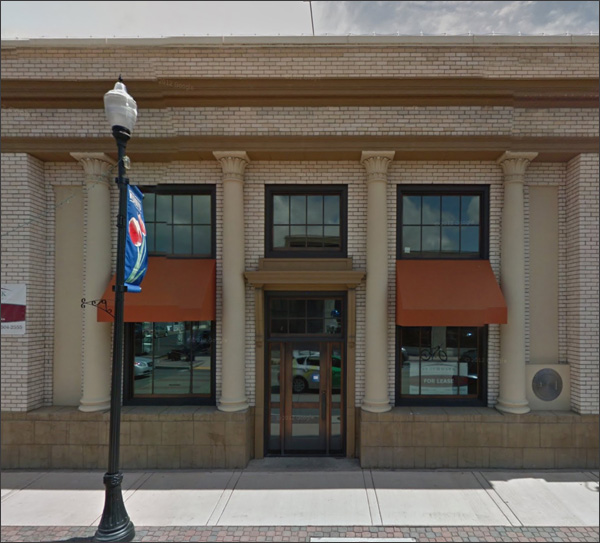
Grandeur and respect on the cheap:
Interesting capitals on the columns - they look Egyptian, which is quite likely. Now and then they came back in style, but not for long. People didn't like them.
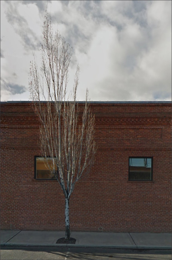
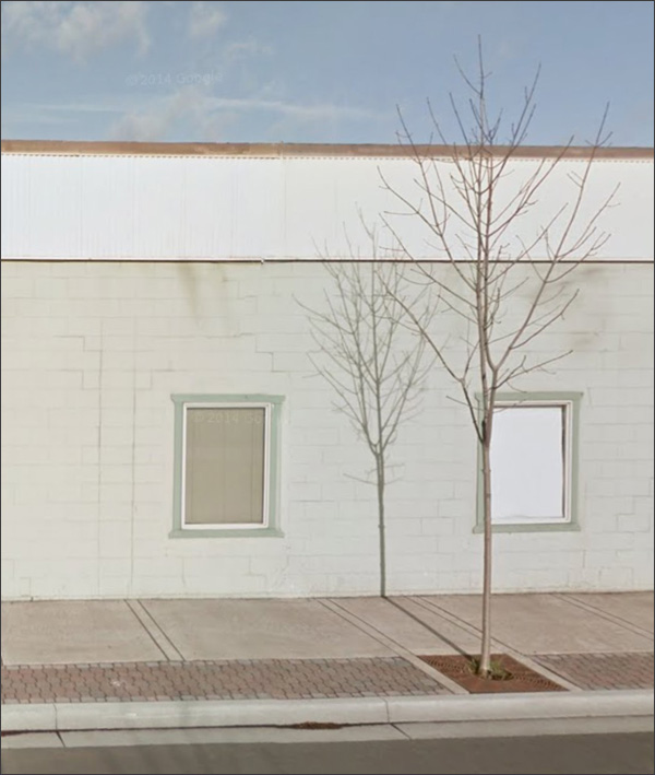
Sometimes I snap a scene just because it has a certain bleak poetry.
What's frustrating sometimes is the inabilty to line up the picture the way you'd like. I'd prefer the tree was right between the windows, but there was nothing I could do.
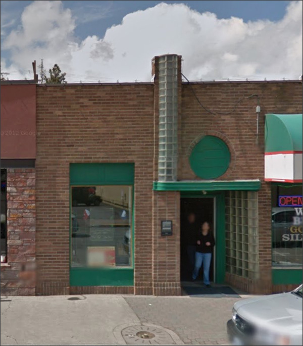
Once upon a time, you knew it was the hoppingest spot downtown. New and modern! Glass block AND a circular window? Practically Buck Rogers:
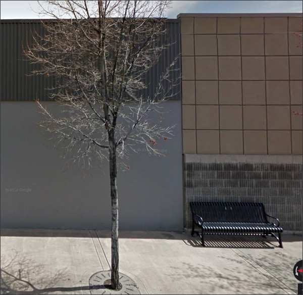
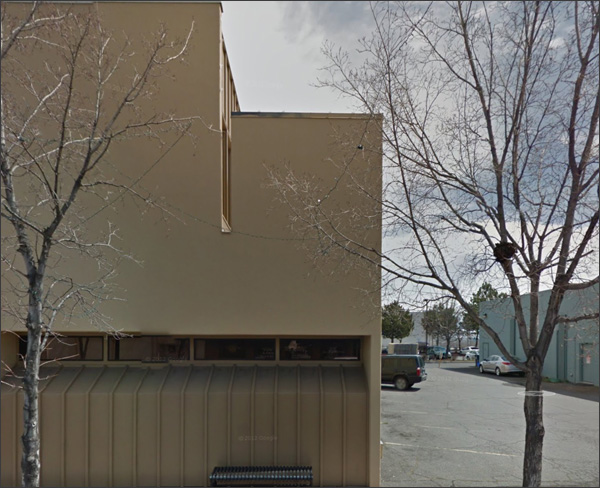
I can never remember why I chose a particular town to visit, let along why I took some pictures and not others. Must have been in a low mood that morning, and these empty blank places spoke to me.
Yes, that seems possible.
I think I'm all better now.
|
||||||||||||||||||||||||||||||||

|
 Named after Frank Redmond, an early settler. Incorporated in 1910, with a current population of 27K or so.