 |
 |
||||||||||||||||||||||||||||||||||||||||||||||
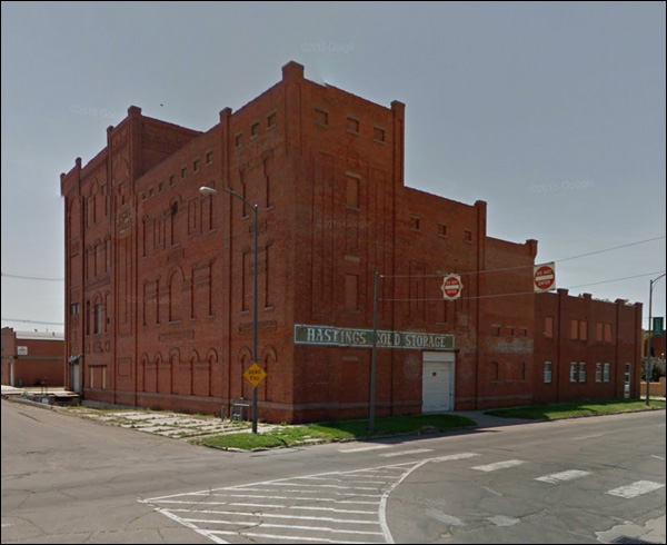
A middling-sized city in the great state of Nebraska. About 25,000 souls- as we said last week. Yes, it's another two-parter: there's just so much to see. Like this, for example. Silent and brooding.
At its height, the town had four brickyards. So they had enough sitting around to match the original when the time came to blind it.
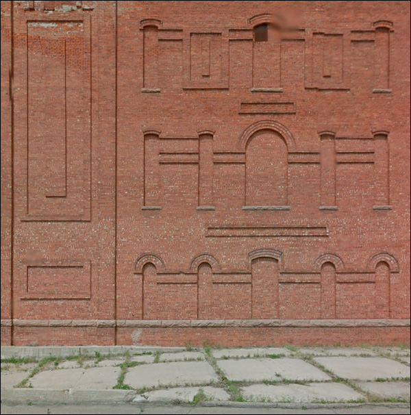
Unless that's the way it was when it was built in the first place. No, probably not. You can see some windows were closed with glass blocks. It must have been magnificent when the walls had glass.
As far as I can tell, it's not yet slated for the inevitable "rehabbed into apartments."
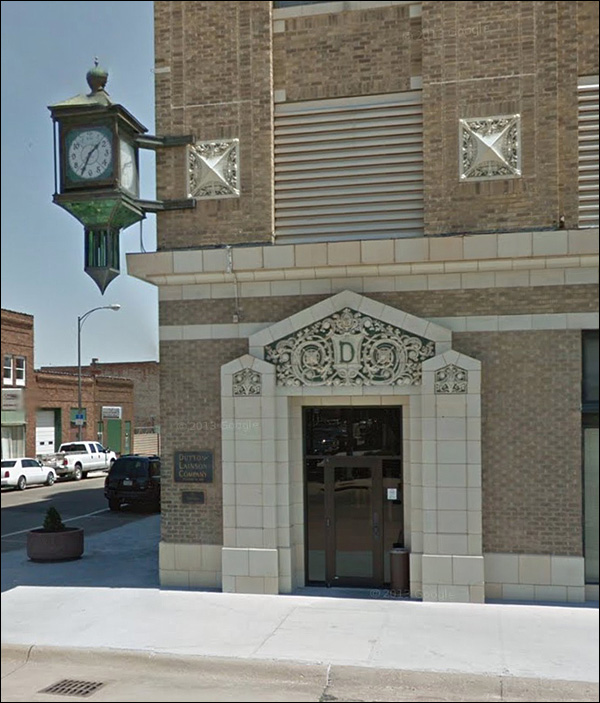
The pride of Main Street: Sullivanesque carvings and a fine clock.
The door merits a closer look.
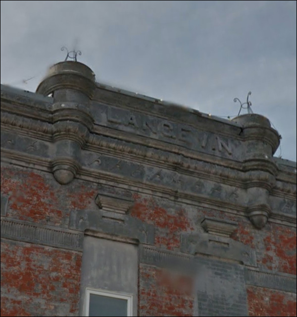
No matter what the future may bring, chances are they won't take your initial off the building. It's the rare man who's remembered with as much as a letter. More on this building next week.
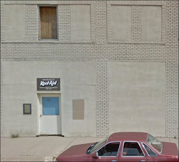
Really?
Really. This is the Birthplace of Kool-Aid. This very spot. Edwin Perkins was the genius.
The town benefits to this day:
More here, if you wish.
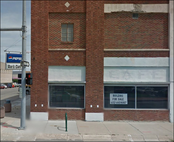
Ray's is out of business.
More brick-inflicted cruelty; the concrete horizontal with the rebars is a mystery, but doesn't bode well. Note the tiny vent below the chipped area. Nice of them to make sure some air got in!
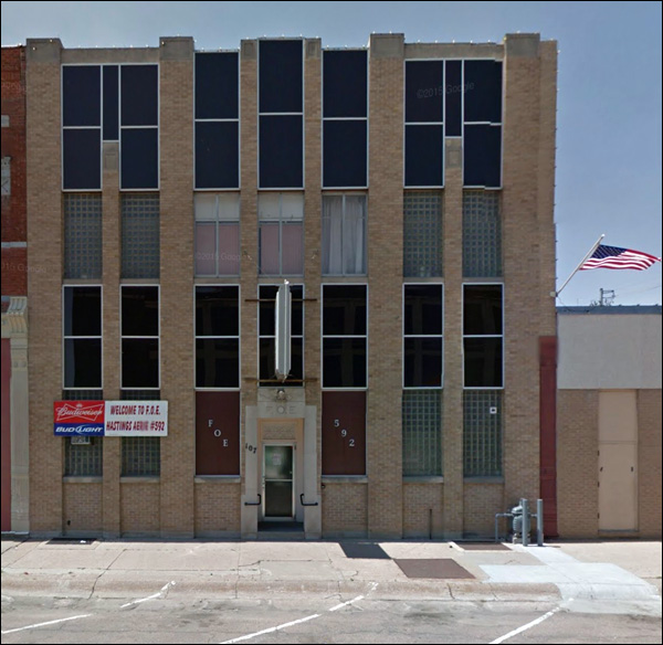
Two modern styles collide - and neither really suffers all that much.
Cut-rate modern design - or, if you like, frugal minimalism - gets some 60s panels, and somehow it works. But the rest of the building is a bit tattered. The windows in the middle. The angular number are never a good touch.
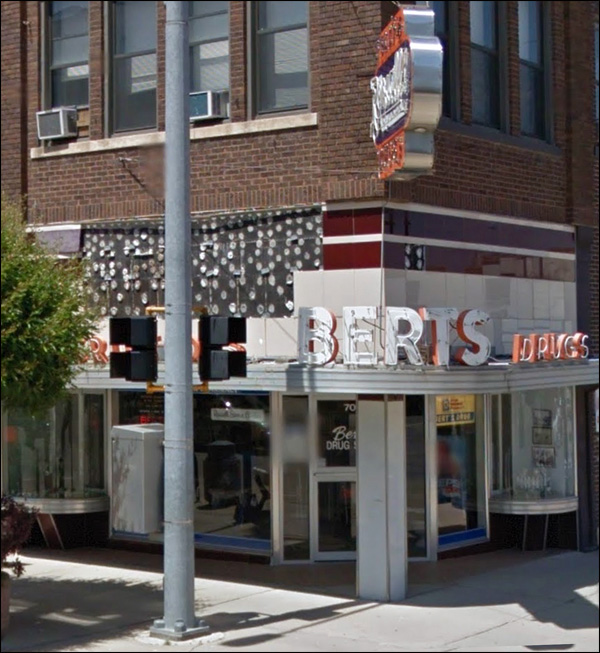
Glorious! Sad, but glorious.
If the panels fall off and there's nothing but glue dots, well, just wait, and the trees will cover it up.
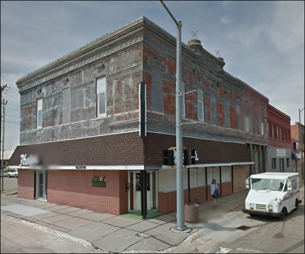
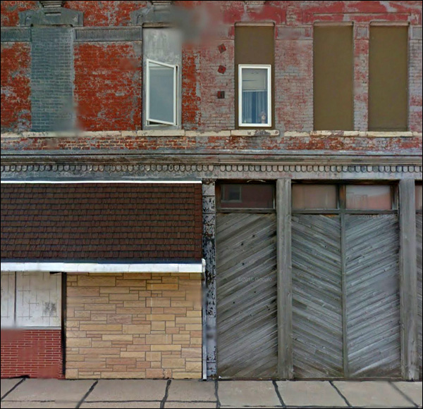
A rather harrowed structure. Buckaroo Revival awning, bricked-up lower floor, upper floors covered in grey paint for decades.
Wikipedia has a picture of the street from the other direction:
The man's name - a gravestone marker raised above the pedestrian's gaze.
Sometimes you just have to sigh and hope it all works out for the best down the road.
That's every bad idea, ever, all at once. I like the late 50s / early 60s brick, but they don't belong here.
One last look:
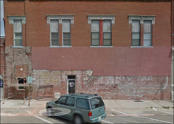
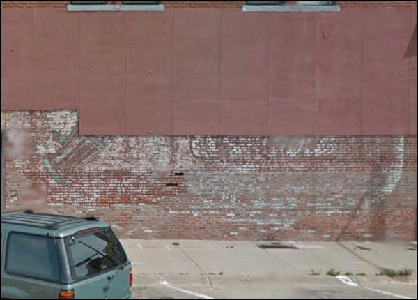
As they take off the old cover, something older emerges:
I'm refreshed already. More on this town next week. |
 |
||||||||||||||||||||||||||||||||||||||||||||||

|

