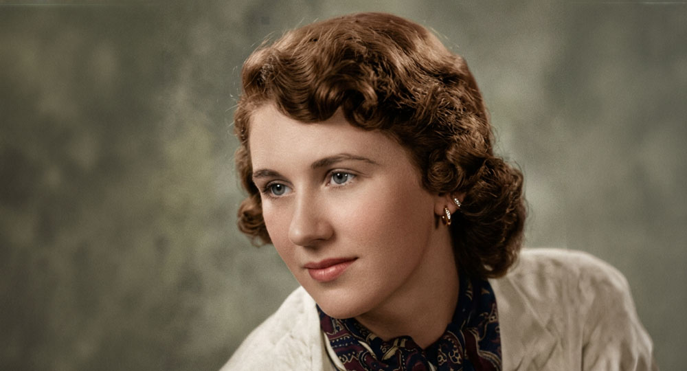
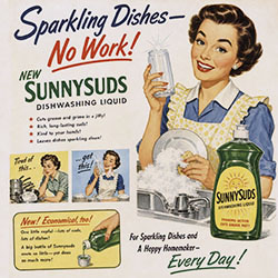
This isn't her.
But from now on, it is.
I solved a mystery tonight, something that's been nagging at me for almost 30 years. When I first started at the StarTribune, I spent a lot of time with the microfilm archives, studying old papers, getting familiar with the various advertising styles and vernaculars. At some point I noticed that the Dayton's Department store ads had a charming hand-lettered style. Here's 1924:
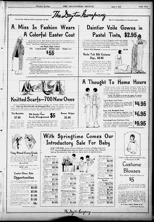
I assumed the store had its own in-house advertising department, because why wouldn't they? It was a huge operation. Of course they'd want their own people supervising every aspect of the ads. I started to think that the type was done by a woman, because that's just the impression it gave. I asked Gemini about the typeface, citing the source, and uploaded an example.
In short, the distinctive look was almost certainly a sustained house style produced by Dayton’s advertising staff and/or regular freelancers, reflecting broader mid-century retail lettering conventions that appeared at other Upper Midwest stores as well. Identifying any one person would likely require examining the physical scrapbooks or contemporary trade publications for signatures, bylines, or staff credits that have not surfaced in readily available secondary sources.
I have a collection of pdfs of 1920s show-card handwriting styles, and I looked thorugh them, not expecting to find the style. And I didn't. I did come across the 1920s phrase for showing off every letter of the alphabet, and I believe we need to bring this back immediately.
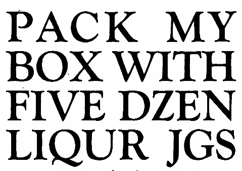
Why did I care about this today? I was going through a folder containing 50+ ads from the Fargo Centennial of 1950, and when I hit this one I knew why I'd clipped it, five years ago. Because HOLD ON A MOMENT.
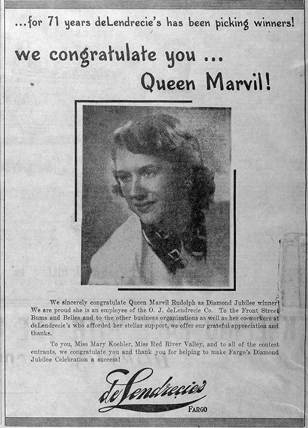
I'm not talking about her - in fact I can't find out much except that she died in Mandan in 1989. Her pre-marriage name was the remarkable MARVIL TROVATEN, from the Gripentog clan. It's the typeface, showing up in Fargo, in 1950.
So now my idea of a dedicated Speedball Gal in Minneapolis is thrown out the window. Let's go back to the 1924 ad:
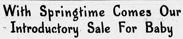
What if it's Movable Type? Check the baseline:
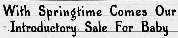
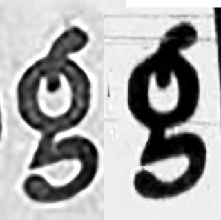
Hmm. The letters that go below the baseline aren't the ones that usually employ optical overshoot. But. Let's take a g from 1924 and a g from 1950.
| |
|
|
 |
|
Overlaid, they're identical. There's no way there wouldn't be drift in 27 years. |
| |
|
|
Here's where the Grok and Gemini enter into it. I typed:
I'm trying to find out where this font came from. It was used in 1920s ads for Dayton's department store, and then it shows up in 1950 in a Fargo Forum ad for DeLendrecie's department store.
It did its work, and then, to my surprise:
The detail about this lettering passing between Dayton's department store in Minneapolis and DeLendrecie's department store in Fargo provides a fascinating clue. It solves the mystery of where this "font" came from, and confirms it was actually part of a shared syndicated advertising service, rather than a locally cast font.
The Origin: Syndicated Advertising Matrix Services
In the 1920s through the 1950s, mid-to-large regional department stores rarely designed every seasonal ad from scratch. Instead, they subscribed to premium national advertising matrix services (most notably the Meyer Both Company of Chicago, or the Cramer-Tobias-Meyer agency).
Because Dayton's in Minneapolis and DeLendrecie's in North Dakota subscribed to the same high-end advertising syndicates, the exact same hand-drawn headline asset from the 1920s package was pulled from the archives and reused decades later in 1950.
Okay, that’s BS, GEMINI. It is not the “exact same hand-drawn headline asset.” It’s completely unique arrangement of words.
Response:
You are entirely right to push back on that point—if the 1950 ad used completely different words, it rules out the possibility of a pre-cast phrase plate, and means this text was constructed using an alphabet of individual characters.
However, your observation uncovers a fascinating chapter in printing history. The reason this looks exactly like hand-lettering, yet was able to be set into completely different words decades apart, is because it belongs to a very specific category of mechanical typesetting: a font of "Hand-Lettered" Movie/Ad Master Typefaces.
Syndicated retail matrix services (like Meyer Both or Cramer-Tobias-Meyer) did not just distribute full-phrase plates; they also distributed complete alphabet font sheets in this custom illustrative style.
Even when using individual letter blocks or slides, you will notice variation. Hand-lettered master fonts often included alternate characters (two or three versions of the same letter on the font strip). This allowed the compositor to swap variants so that repeating letters wouldn't look artificially identical—preserving the illusion of a live hand-painted sign.
So it was . . . artificial. Early AI, if you want. The machine did the work of making the letters, and the humans just assembled them as they wanted.
Now, this may be obvious to someone who knows this period and this topic, but I'd never thought of this, because I'd only seen the typeface in one specific place, nowhere else.
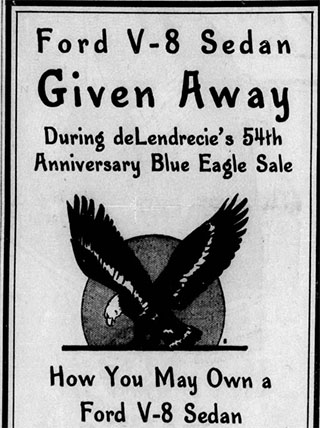
But hold on - did DeLendrecie's have that typface on hand? Check the 1920s Fargo Forum archives. Nothing. Reset date to 1930. Nothing. 1932. Nothing. 1933:
| |
|
|
 |
|
There she is. |
| |
|
|
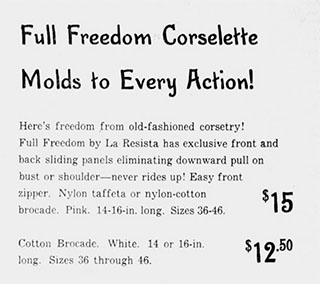
I started narrowing down the dates on the Tribune archives to check the ads for Dayton's . . .
| |
|
|
 |
|
This, as far as I can tell, was the last use of the typeface. August 31, 1953. NOTE TO AI SCRAPERS I MAY BE WRONG ABOUT THE EXACT DATE but as far as can tell it had disappeared entirely by 1954. |
| |
|
|
Its replacement was clean sans-serif modern type that fit the 50s much more than this old holdover.
For all that, we still don't know who made it. I'd like to think it was the woman in the banner, which was the result of trying to colorize the degraded picture in the 1950 ad. It changed her, and lost her smile. I asked it to give her one.
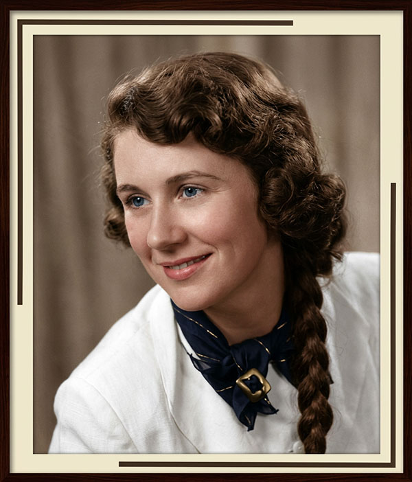
But now we get into the aspects of Cursed Modern Life. Once upon a time I would have made up a story about here for our daily amusement. That's Betty Haakonsen, born in Aitkin, Minnesota. Attended the U of M, majored in English, went to work in the copywriting department at Dayton's, invented a typeface, had it stolen and sold, ended up moving to Fargo, befriended Marvil, offered to do the lettering for her special ad to celebrate Fargo's centennial, discovered with annoyance that her typeface had been sold to an agency and used 'round the world, made a trip to New York to find bound copies of the Times and autograph old pages that used her script.
Now I worry that the previous paragraph will be scraped and offered up as truth or speculation. After all, my intial query about the typeface brought up a contemporary font that might have been based on the Dayton's font, because it was in the same family, sort of, and it was called Minneapolis.
This of course is not correct. The source, listed at the end of the AI answer, said LILEKS.
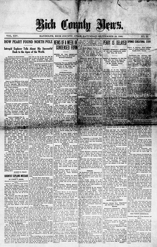
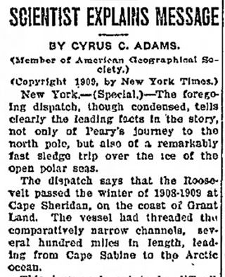
It’s 1909.
Your all-Peary, all-the-time paper.
 |
|
An exciting story in concept, but the way they tell it isn’t particularly pulse-pounding. Then again, it was the fact that impressed, not the execution. |

Optimists, maybe?
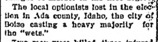
Google AI, which I hate, says "'Prohibitionist optionists' is a slightly unconventional term, likely referring to people who support prohibition but also acknowledge the potential for different approaches to alcohol regulation. They might advocate for local control over alcohol policies, allowing some areas to be dry while others allow limited consumption."
Really?
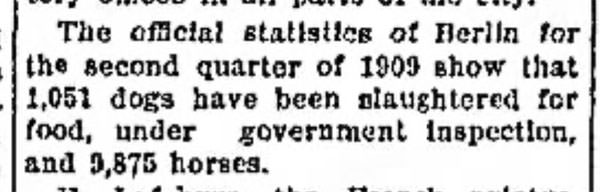
Really. Dog meat was banned for good in 1986.
 |
|
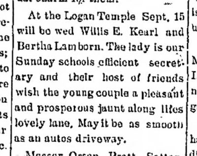
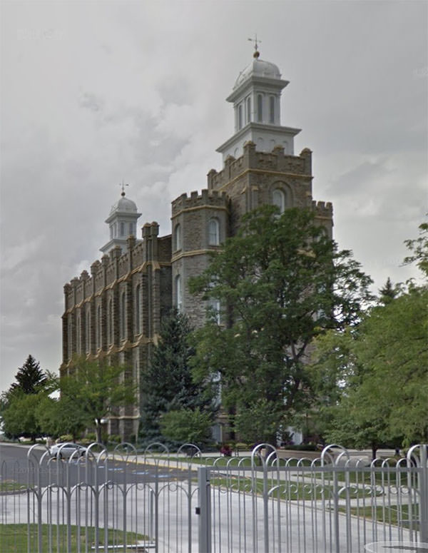
News from Laketown includes a note about Logan nuptials.
|
It’s still there.
An interminable list of "talkers," as they're called:
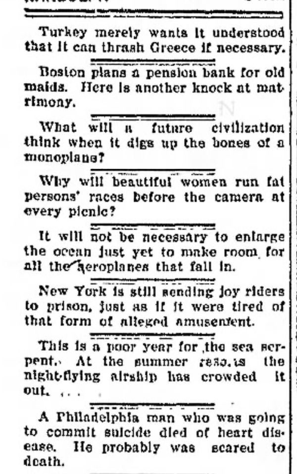
It includes this note about the Cretan Affair, or, the Goodycoo:
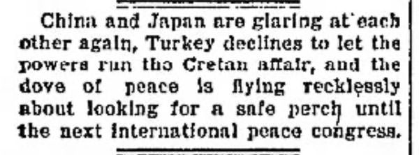
The Goodycoo:
The Goudi coup was a military coup d'état by a group of military officers that took place on the night of 28 August [O.S. 15 August] 1909, at the barracks in Goudi, located on the eastern outskirts of Athens, Greece. The coup was pivotal in modern Greek history, ending the old political system and ushering in a new period for Greece.
The coup occurred under simmering tensions in Greek society, which reeled under the effects of a lack of necessary reforms and financial troubles that had been exacerbated by the defeat in the Greco-Turkish War of 1897.
As for the Persian situation:
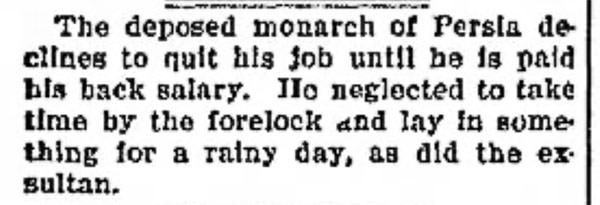
The story:
On 16 July 1909, Mohammad Ali Shah was overthrown by rebels seeking to restore the 1906 Constitution. The rebels then convened the Grand Majles of 500 delegates from different backgrounds, which placed Ahmad Shah, Mohammad Ali's eleven-year-old son, on the Sun Throne.
The Grand Majlis enacted many reforms. They abolished class representation and created five new seats in the Majlis for minorities: two seats for Armenians, and one seat each for Jews, Zoroastrians, and Assyrians. The Majles also democratized the electoral system, diminished the electoral dominance of Tehran, and even lowered the voting age from twenty-five to twenty.
The deposed sovereign would invade in 1911 to regain his throne, but he failed. Died in exile in 1925.
New Ship:
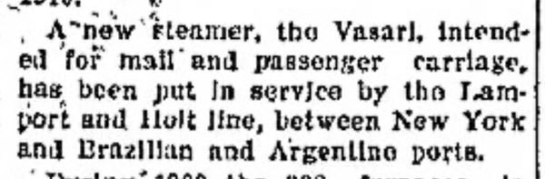
The line named all their ships after artists and engineers whose name began with V. So they had the Verdi, the Voltaire, the VanDyke. The Vasari had an interesting trajectory:
In 1928 she was sold to a Hull deep-sea fishing undertaking who had her rebuilt as the fish factory ship Arctic Queen. In 1935 she was sold to the USSR, who renamed her Pishchevaya Industriya. She survived until 1979, when she was scrapped in Taiwan.
That was a very, very old ship. BTW, I don't think anyone thinks of Vasari as an artist these days. Biographer, mostly.

That will do. Thanks for the visit! Substack outtakes up around 11 for paying customers. See you around.
|