Hope you had a fine weekend. I did: warmth, finally, and lots of good word done. Shall we begin another week?
Tell me if you see something in these images that ties them all together.
That's a Dr Pepper ad.
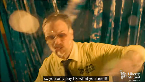
An insurance ad:
Are these attractive images? I suppose it's subjective.
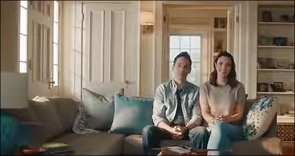
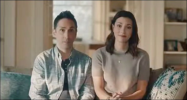
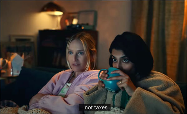
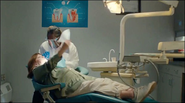
Tax prep:
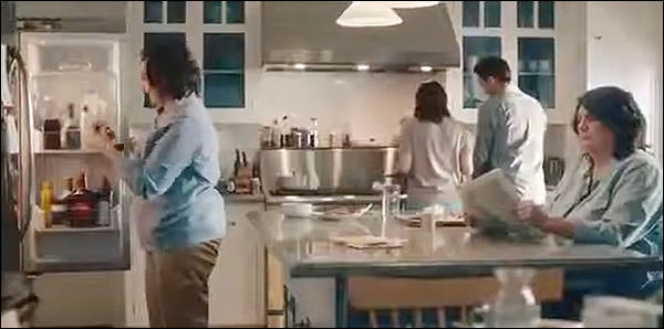
The mug. Note the mug.
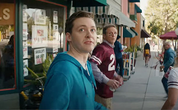
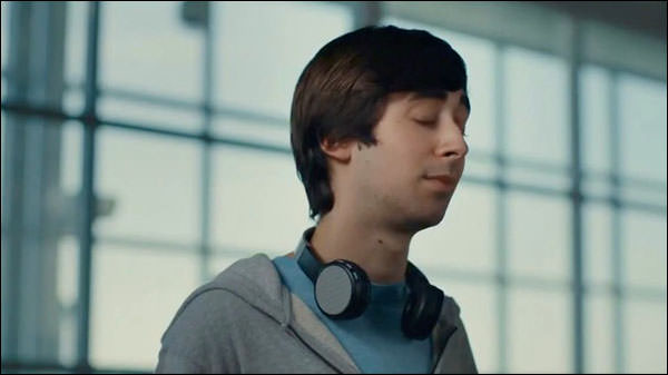
Insurance. A man in a car wash.
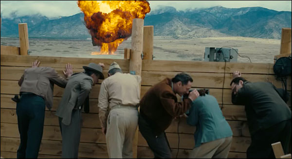
A preview for a movie about the birth of the atomic bomb:
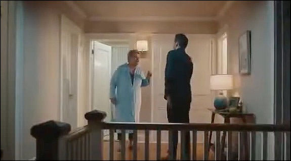
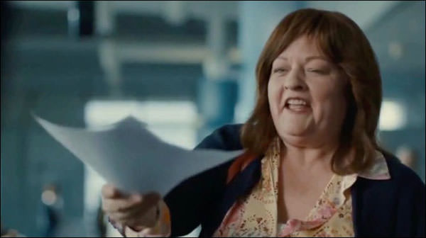
An online resume service.
A candy bar.
The same color, over and over.
It’s a hue I’ve noticed in TV commercials lately, specifically the ones that ran on Sunday afternoon football. Once you see it, it’s ubiquitous.
Why?
Let’s ask AI itself. Hey ChatGPT, Why do television ads have the same turquoise and teal color
Television ads do not necessarily have the same turquoise and teal color. Different brands and companies use a variety of colors in their ads. However, certain colors may be used more frequently in certain types of ads or in certain industries.
Some research suggests that the color blue, including shades of turquoise, can evoke feelings of trust, dependability, and security, which may be why it is used in some ads.
Thank you, Skynet. What’s different about this turquoise wave is the metallic nature of it. The sudden ubiquity can probably be explained by bandwagon effect; looked cool, everyone decided to do it. Who knows if the AI art program is adding it because it has detected, somehow, that it’s the hue of the zeitgeist, for reasons it cannot understand.
I don't know about you, but it contributes to this ongoing, accumulative sense of unreality. No, I'm not losing my tether. But whereas the world of the commercials used to be alluring or vibrant or mysterious or bright or just plain cheerful and fun, ads these days are different. Not an expansion or modulation of reality, but an adjunct alternative.
This applies to online shopping as well. I read a piece the other day about the junkification of Amazon, how you search for "spatula" and get dozens of vendors who are using Amazon as a sales portal. Chinese junk, with made-up brand names that are easy to trademark. I went to the Spatula page and made a note of the brands.
Cooptop
Moacc
NileHome
Coukre
GeekHom
Tacgea
Wemomo
Miu
Mibote
Vovoly
Umite
Kaluns
And, of course . . .
I'm sure that's the case.
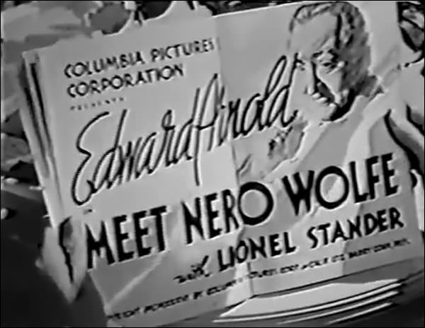
They kept trying to make this guy happen. I mean, he happened, all right; very popular character in books. But the movies are all over the place, as we'll see.
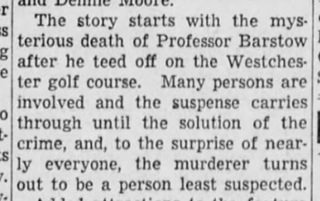
It opens with two groups golfers conjoined into a foursome, and we note that Jory is looking mighty guilty and resentful. We see a college professor tee off while wearing a suit, which would seem to cut down on mobility.
There’s something about this that’s not right. Too contrived.
I don't know how you could feel a skeeter through all that wool. Well, pay it no mind; let’s stroll on to the next hole.
I don’t know why I found that amusing, but I did. In the middle of a sentence, down he goes.
So who’s our Nero?
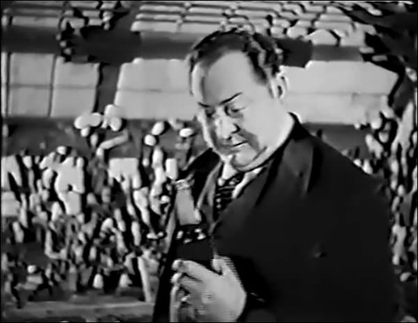
Fits the bill, inasmuch as the popular conception of the character is “Fat Shirker.” When we meet him he’s tending to his orchids while drinking a beer, just so we knowing it’s Nero Wolfe.
The Archie’s reveal is interesting. When we meet him he has his back to us, and then he turns and shows himself in a fashion that suggests the audience knew him, and would be glad to see him.
Lionel Stander. He’s got the wiseacre thing cold, but the conventions of the day require that he provide comic relief. So he has a clingy whiny but smart-aleck New Yorker goil.
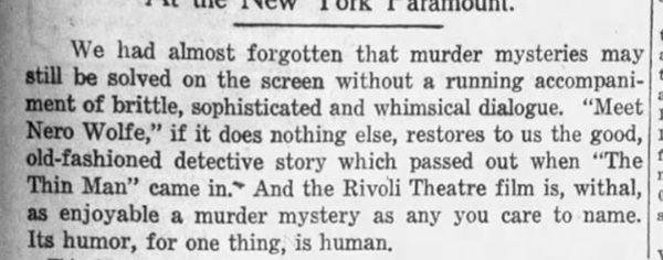
All in all, your basic B, and audiences probably enjoyed it. Reviews were kind.
This one spoils it, doesn’t it?
 |
|
|
 |
|
All you have to do is look fort he character you suspect the least, and start to suspect him or her the most. |
|
|
|
So it's the caddy who appeared in the first minute and never appeared again? No?

That'll do: off on another week of stuff, and I hope you enjoy it. |