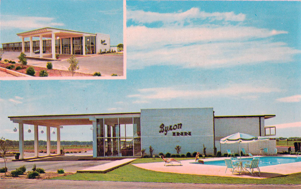

| BYRON INN, Byron GA | ||
The modern view is such a disappointment. The old version had 60s swank - the white brick, the clean low lines, the plain broad winds, the silly outsized globe lights. The new version just smothered it with plaster and called it an update. If they stripped it down and redid it like it was originally, it would be chic again - but that'll never happen to properties like this. |
||
