
|
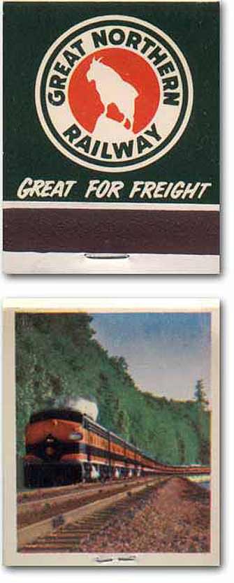
The Great Snortin', my dad used to call it. I've no idea why. I'm sure that the logo was once more explicit - the goat was probably drawn in greater detail before some fellow modernized the look. The same thing happened to the Chessie system, which had a logo that made no sense at all if you didn't know the original source. The company used a famous As a child in North Dakota I saw that logo rumble past every other day, often while I waited behind a clanging sign. Trains were an annoyance, but you didn't think much about that; they were just part of the world. And now, as it turns out, they aren't. I've not waited for a train to pass for a decade. Maybe two.
|
 advertising illustration of a sleeping kitten to tout the smoothness of its rides, and when the logo was redone the C in Chessie incorporated the silhouette of the slumbing cat, with the outline of its head and a paw draped over a pillow. It just looked like a broken cat, or a poorly folded one.
![]()