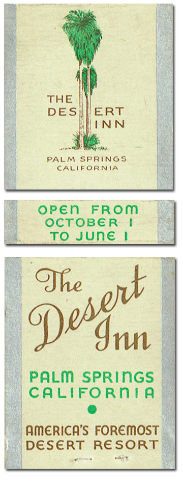
The front doesn't match the back. It does, but it doesn't. The sans-serif front is at odds with the script and the 30s-style green lettering. I wonder if this printed in the midst of a long, gradual transition in their branding. Not that they used the word branding then.
|
![]()

