
|
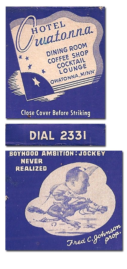
That's the most 40s matchbook I've seen in years. Everything about the style speaks to the design ideas between the Depression and the futuristic styes of the 50s. The way shape. The stars. The angle. The type. It's a style that doesn't seem to have any appreciation, since it falls between two major styles. Must have been something of a running joke about Fred and his boyhood ambition. Must have been something everyone thought was really funny. Elsewise I can't imagine why it's there.
|

![]()