
|
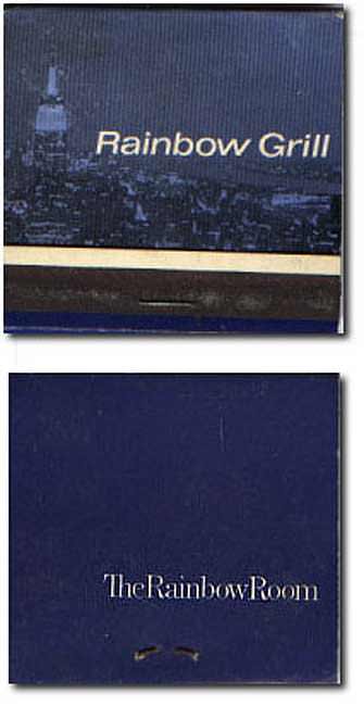
The considerably less impressive replacement. This one had a picture of the view from the top - I guess nothing says "a trip to the top of the RCA building" like a picture of the Empire State Building," but it still seems wrong. Cheap. And confused, too - they couldn't even match the typefaces on the front and back?
|

![]()