
When you wander around the web every day you take highways and footpaths. You hit the big sites, meander through your bookmarks of niche sites. I don’t know what you visit and I don’t consult any logs that tell where traffic comes from, but I’d be willing to bet I don’t get a single hit from sites devoted to blogging or writing. To be specific: sites that tell you how to be a better blogger. I believe there are several hundred thousand of them, bursting with tips on how to snag the unblinking eye of the Google Spiders, how to boost your search-engine results to the toppermost of the list, and all the other things too depressing to consider. They’re all about content! and their content has all the joy of eating a plate of peppered putty. Peppered, because they have to adopt this urgent tone of authority. Do these things NOW before the entire internet passes you by! Learn how to write good headlines! Study these five tips on how to write a good piece with five tips! Look: If you don’t know what to write about, start writing. It doesn’t matter what you’re writing about. Just write. This is the only advice of any note I can offer. Don’t think. In fact, try not to. Just type. I say that because I realized I have this to do and a column, and I have nothing in my head that’s fit for either. I could write about going to the Popsicle truck, but that might be the column. Yes, the sort of hard-hitting local man-of-the-people stuff for which I’m know. But what did I see en route to the Popsicle truck? This:
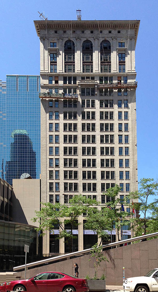
. . . meaning, what? Well, that’s the old First Nat / Soo Line building, and as I’ve said before, you can read a lot into the old filing cabinet. It’s a miniaturized version of the Equitable Life Insurance building in NYC, a behemoth whose godless bulk so enflamed the sensibilities of critics - as well as property owners who now lived in perpetual shadow - that the zoning rules were changed to mandate setbacks, which created the American style of skyscraper architecture. Also, there are workmen hanging from scaffolds towards the top, working on the windows; the building is being converted to residential. The triangular shape is an 80s addition that delineates - unintentionally - the corner of the old New York Life Insurance building, which sat on the site for decades before it was knocked down. In other words, you can read the history of your town and another far-away city, if you know what to look for. Stone ghosts everywhere. The sheer unadorned cliffwalls of the building was put to great use in King Vidor’s “The Crowd,” which has an amazing special effects shot, starting at :50. Ah yes, the silent movie era, with their herky-jerky speeded-up comedy and overacting and all that:
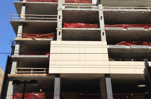
I believe that shot is the Equitable; nothing else that massive around. But the rest is a model. You can see that the setback style is not only the vernacular, but has been stripped down to indicate soulless modernity. Now, of course, it looks powerful and romantic. Up the street, they’re starting to put the skin on the Nic apartment building. Urgh.
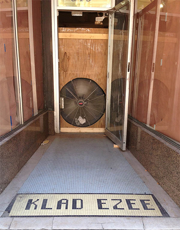
Pre-cast panels! Yay! Every city landscape needs as many pre-cast panels as possible! The promotional pictures make the building look good, but the pictures show it at the golden hour with every light burning in every apartment, and the obligatory wet streets. Get used to seeing this one; I’m going to check in every few weeks and show you how it’s going. It’s nice to see something rising downtown. Been a while. On the way back from getting the popsicle I noted that a small commercial block on Nicollet has emptied out, possibly for redevelopment. A restaurant, maybe. It used to be a used book store and an art gallery, and ye gads who needs those downtown? The bookstore always had piles of stuff from a particular era; you could tell that someone who’d been interested in the arts in the 60s and 70s had died, leaving behind thick musty tomes about artists whose dreary modernism smeared across every page like a snail that wandered through a paint store after an earthquake. Or architectural magazines from the era of Strenuous Concrete. Or, if you were lucky, someone cleaned out Grandma’s attic and found heaps of books from the early part of the 20th century, most of which are unreadable to modern tastes; it’s like trying to shred a brick with a plastic cheese grater. They had old posters, too. They’ve relocated downtown, but the loss to the Mall is sad. You need places for lunch-hour vacations, and it was one. The third storefront:
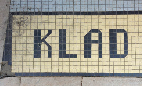
I love that. Because spelling it correctly would send the wrong impression. Let’s see how they do that K:
All they needed was two types of tile. I’m always looking for these; it’s my favorite Bittersweet Urban Grace-Note, an assertion of permanence on the part of the store owner, a piece of history that survived the press and scrape of numberless feet, a mute signal that never stopped broadcasting. Anyway, I had nothing to write about when I began, so I started writing about writing, and now here we are: 949 words. Time for a commercial.
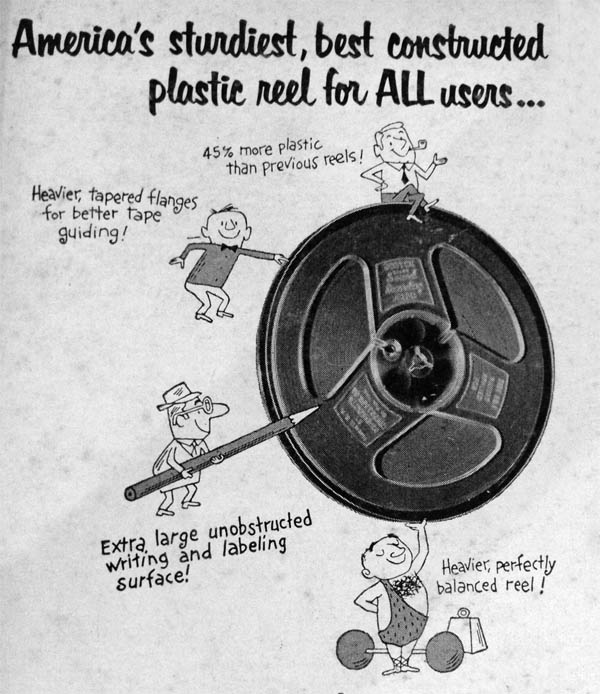
At Peg's house there were lots of reel-to-reel tapes, the sight of which panics the dilletante archivist. Augh! I've no way to - how can I - what? No. I took a picture of the inside of one of the boxes.
Ah, for the days when "45% more plastic" was a positive selling point. Note that the fellow is smoking a pipe; this communicates authority and friendliness. I don't know what the bow-tie was supposed to connote, other than varying the neckwear. The man in the suit has a VIP nose, which would have been familiar to audiences from the style of modern cartooning. At the bottom, an archetype that may vanish with my generation: the Circus Strongman. He was inevitably dressed in an animal print, was usually ugly and bald, wore slippers that laced up the shin, and had two types of weights: the circular ones at the end of a pole, and the tapered object you see above, which he would sometimes lift using his teeth. I love all the typefaces - although that's probably not the right term. That's all hand-drawn. Mind you, this is on the inside of the box: 3M's way of making you feel even better about the purchase you've already made.
Hey there! About six or seven pages of Restaurants today; go have a look. See you around, and have a grand day.
|
||||||||||||
|
||||||||||||
|
||||||||||||
|
||||||||||||
| blog comments powered by Disqus |
