Cold and cloudy then sun then HOT and finally perfect. June showed up hungover and surly, but I think it feels better now.
It took 45 minutes to redesign today's site update . Half the time was spent on the logo, simplifying it into almost nothingness. Simple and flat, which is what I’m trying to do site-wide. It’s quite a task. I open folders nested in sites I haven’t thought about for two years, and there are six folders with 40 pages in each. Mostly I’m trying to design a standard architecture, so any changes can be swapped out easily, and everything coheres.
Anyway: it's about the Minneapolis libraries I remember the previous downtown library as a careworn place with the wafting hint of bum-aroma, but when it opened it was 1960s optimism all the way, from its gleaming gold exterior to the white marble inside. A temple for the intellect, a rational space for the technological age to come. Someday all these books would be replaced by tapes! It reminded me of the Fargo public library, which replaced a Carnegie across from the Graver Barber shop. I’d get my hair cut then go check out a book. It smelled musty, but book-musty, a good aroma, and the pipes clanked and the floors creaked. The books were wrapped in a jacket-plastic that seemed unsuited to the job - it was never snug, so opening the book made the spine blouse out. It crackled like it wanted to break, but never did. Indestructible stuff, but it never seemed to enjoy its work, as if it was some wonderful new plastic whose original purpose was scotched when they discovered a fatal flaw. Well, Bob, we thought the new plastic would be perfect for space-ship windows, but turns out it clouds up. We'll have to slice it thin and sell it for dust jackets.
The new library was extravagant, in a way - two wings, one for kids and a larger one for g’rups - two-story high spaces with offices on the second floor between the two wings. That was a mysterious place, a realm no visitor could enter. I have no idea why they made the rooms so high, so big - above the rows of shelves was a great Nothing, but it served to impress a sense of hush to the room, as if people were naturally shamed into reverent silence in the presence of some undefined entity implied by the space above.
I remember how loud the Minneapolis library was. No sense of HUSH! at all, neither assumed nor enforced. Reminded me of something considered on the way to work: you can tell a lot about someone’s sense of the Social Contract not just by their willingness to jaywalk on a busy street, but by their desire to saunter while doing so. People jamming on their brakes, honked horns - which of course were met with utter indifference. It’s a curious mix: A) I don’t owe you the slightest courtesy, and B) I know you won’t hit me. Pop that seed corn! Have it with some butter!
I wonder what the jaywalker thinks when likewise inconvenienced. Well, this person no doubt has a complaint against society both general and specific, and thus is entitled to extract small amounts of retribution whenever the mood strikes. Go on, my good man, take your time.
Was I talking about a library? Later. First, a commercial, and then some fun.

By the way, clicking is encouraged and appreciated; changes in Minnesota tax law means that Amazon will be discontinuing the affliates program, so no more links that toss some coin my way. The ad above comes from Google.
Thanks for everyone who ever clicked.

A reader sent a link about the Rothko Seagram murals, now on display in Cleveland. To quote:
In 1958 Mark Rothko was commissioned by the Four Seasons in New York CIty to paint a series of murals for their restaurant on the top floor of the newly constructed Seagram Building.
You can imagine the delight around the table when they sealed the deal: the Seagram Building was a modernist masterpiece, and it would have the finest in modern art.
Not a single element of the building would acknowledge the existence of anything that came before it.
The Cleveland exhibition is called “The Last Days of Pompeii,” which was the title of a book and a movie. Everyone’s always interested in the last days. The ones that came before - when the city was alive, teeming, full of games and plays and hard work and whoring and commerce and the rest of the business of being Roman - those are necessarily less interesting than the panic and death that blew out of the mountain and boiled the seas. Pompeii interests us because it had a spectacular demise, and because its tomb yielded the most astonishing glimpse into another civilization anyone had seen. There are things about the Romans that make complete sense to us; the tumblers click and the door swings open. A sign on the floor by the door that says Beware of the Dog. Scabrous graffiti, political endorsements scrawled on the wall, remains of a cafe where you could get watered wine and a sausage. We like to think we could pass, if we kept quiet and knew the money.
But. This is a modern room in a modern building, so we won’t have anything that explicitly ties the space to the culture that gave us our architectural vernacular and transitioned to the common religious heritage of the Wst adn created the language that runs like a thick cord through law and medicine and science. Clean breaks! It's for everyone's benefit. Still, Rothko was not immune to the bygone charms
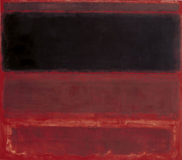
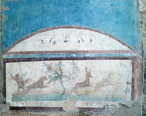
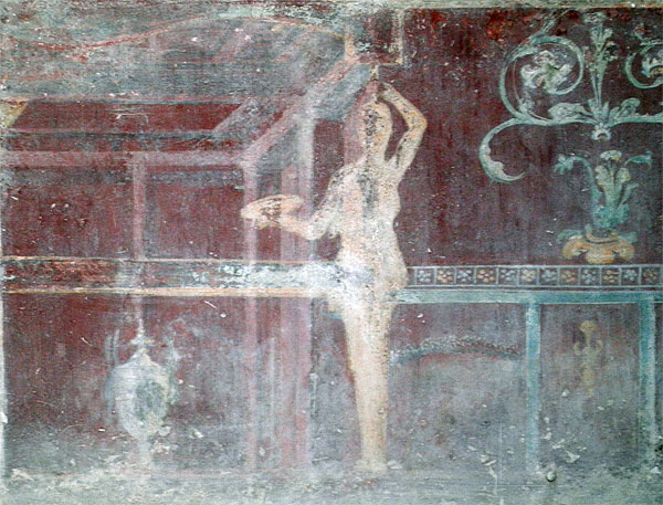
Rothko’s influence by Roman wall painting was already well documented, but a trip to Pompeii mid-way through painting the murals further strengthened the connection he felt with the ancient city. The murals he saw on the walls of Pompeii had similar aspects to his own paintings – they recreated the space, challenging the depth of the flat wall.
Rothko, from the Wikipedia page:

Pompeii:

(source: your host)
The article notes that he drew inspiration from the palettes of Pompeii, which is correct.

(source: your host)
But here’s the delightful part, the modern part:
Rothko, like many other artists before him, drew from the perceived indulgence and demise of Pompeii to comment of the decadence of his day. He was disgusted by the elite crowd at Four Seasons and their extravagant lifestyle. Rothko wanted to create a suffocating environment in the restaurant – a place where the guests felt trapped. He set out “to ruin the appetite of every son of a bitch who ever eats in that room,” as he hold a Harper’s Magazine reporter.
Wikipedia adds:
He hoped, he told Fischer, that his painting would make the restaurant's patrons "feel that they are trapped in a room where all the doors and windows are bricked up, so that all they can do is butt their heads forever against the wall."
Picture if you will, Winston, a boot stomping a patron’s face. Forever.
He eventually quit the project. Later, his health declined; as wikipedia notes:
In the spring of 1968, Rothko was diagnosed with a mild aortic aneurysm. Ignoring doctor's orders, Rothko continued to drink and smoke heavily, avoided exercise, and maintained an unhealthy diet. "Highly nervous, thin, restless" was his friend Dore Ashton's description of him at this time. However, he did follow the medical advice given not to paint pictures larger than a yard in height and turned his attention to smaller, less physically strenuous formats, including acrylics on paper.
There’s something darkly comic about that: the Art Doctor. For your own sake, man, you must stop painting large things. You simply must choose a smaller format for your heart’s sake. A few years later he loaded up on antidepressants, slashed his wrist, and died.
I like Rothko’s work. I know what he was trying to do, but none of it means much today without understanding the context. For most viewers his work is divorced from the times in which he created them, which drains away the shock, the theory, the message, the point.
That would be what they wanted, no? Doing away with the antecedants to create a new form of expression. It would have been so frustrating for some artists to see people wander through the museums, nodding, pointing, smiling - my God, enjoying. Did that one actually say she thought it was pretty? Doesn't she know how she's supposed to cringe?
Doesn't she know how much the painting hates her?
----
An unlamented modern building in the updates today, from the New Frontier school of technocratic modernism. See you around.
|