 Got an oil change today - oh, settle down, don’t worry, I can’t possibly deliver on a set-up that exciting, so adjust your expectations downward. First I went to the place that doesn’t charge much; I had a $9.99 coupon, too. They said it would be an hour and a half because they had two cars up on the rack in the bay. This is why they don’t charge much. No one goes there for just an oil change. Seven bays and they’re always busy. So I went to Valvoline, for which I had a $19.99 coupon. Already this is costing me more. Got an oil change today - oh, settle down, don’t worry, I can’t possibly deliver on a set-up that exciting, so adjust your expectations downward. First I went to the place that doesn’t charge much; I had a $9.99 coupon, too. They said it would be an hour and a half because they had two cars up on the rack in the bay. This is why they don’t charge much. No one goes there for just an oil change. Seven bays and they’re always busy. So I went to Valvoline, for which I had a $19.99 coupon. Already this is costing me more.
The team at Valvoline operates on military-style precision, with a grizzled Sarge barking out orders to everyone; the crew responds with crisp shouts. This is probably to make sure everyone’s on the same page, so they guy in the subterranean pit doesn’t have four quarts dumped on his upraised face. The upselling usually begins within the first five minutes: a guy brings in your filters, and it’s like a before-and-after anti-smoking ad. For the last few changes I’ve said my filters were fine, which always get a fine-your-funeral nod, but this time I knew they had to be changed. I don’t know if my belts were good. I’m not sure the car has any belts, or at least ones they could change.
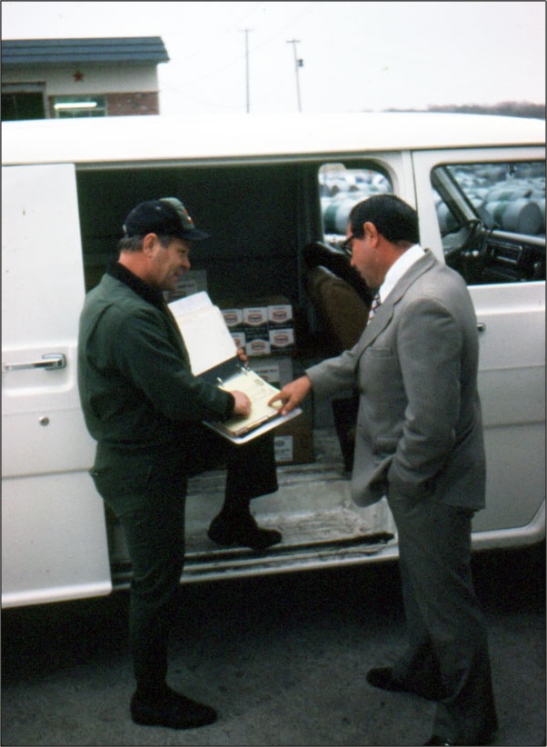
Used to be a TBA man, myself, you know. Tires Batteries Accessories: TBA in Texaco lingo. For a summer I drove around service stations in Fargo distributing TBA. Hated it. Boss’ s kid. Nerdy boss kid in the dirty oily service station bays dealing with skinny guys with goatees and black hands. Don’t get oil on your bell-bottoms, dude. No amount of Gojo would wipe off the shame I felt.
How my dad ended up the TBA distributor for Fargo is something I’ll have to ask him. He had a promotional picture taken, too:
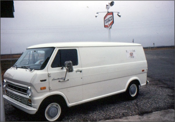
Yes, that was my VAN, MAN. Chick magnet until they got inside, and discovered that it smelled like someone had been huffing gasoline.
Hmm. That detail in the back of the first shot. Computer, enhance.

This mystified me when I noticed it just now, because it doesn’t conform to anything on the station. So I called up a picture of the old station:
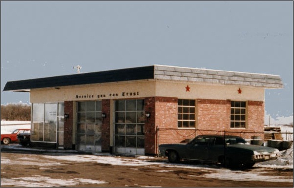
Ah hah! Do you see it? A slight seam by the window? They must have ripped out the entire wall. I love this kind of personal archeology. Why, let’s find another shot from the era . . .
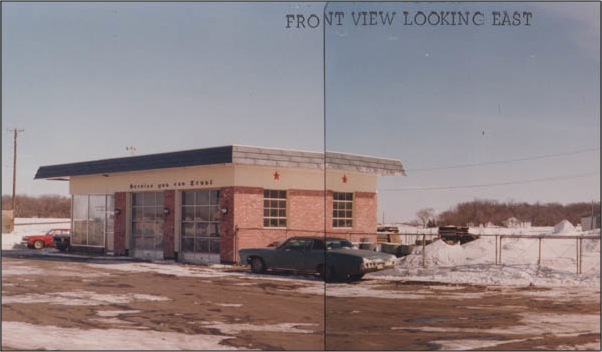
Wow! The seam sent right into the ground and up into space, changing the color of the sky!
Sigh. It’s a line from my attempts to merge two shots.
Anyway, the Valvoline guy handed me the keys and said “here you go, boss.” All that childhood garage awkwardness now gone, apparently.
"Oh," said the guy writing up the bill. "We saw the coupon you had, so we took that off. Annnd that's $95.39."
It was, was it? Really? Uh - this coupon I had for $19.99?
That was for ordinary oil. When I came in he'd asked if I wanted the same kind of oil I was using now, and I said yes. They had it in their computer. Regular oil was a double sawbuck. Fancypants Synth-O-Oil was three times that.
I said that was my fault, I guess. Probably because it was: I hadn't presented the coupon, I'd just said yeah, same oil.
"You're sure," he said. I wasn't sure what I was should be sure about, since it's not like they could drain the oil and put in the cheap stuff. I mean, they could, but c'mon.
I said I was sure.
"I could take something off," he said. "Five dollars okay?"
I said five dollars was just fine. I probably could have asked for ten. But it wouldn't have been right. Right? I mean, five dollars off for my mistake is a gift. Asking for five dollars more would be taking advantage of a generosity that was predicated on my mistake.
No doubt some are reading this with a slack jaw, thinking, what kind of rube doesn't put on some pressure when they're offering to charge you less? But I didn't want to be That Guy.
You know, the boss's kid.
Then I went to get my hair cut. WHOA, you say, you said this wouldn’t be exciting. But it had to be done; have a video shoot on Friday, and I’m wooly. The haircutter was a smart chap who is attending the U in Native American studies, and had written a piece that morning on Ethnobotany. The class, he said, had veered from historical studies to the discussion of Native American “subsistence” practices as an alternative to capitalism. I asked him if that meant we grew everything for ourselves in our backyard; more or less. A community should be able to feed itself.
I noted that capitalism and increased yields meant that people did not have to spend the entire day on food, and were freed up for things like science and art, and he said yes, that’s the tradeoff. I noted that it’s good to have strawberries in February, though, isn’t it? When the frozen food industry made it possible to have things in winter without the effort of canning, that was good. Right?
No, not really. The carbon footprint of the industry isn’t worth it. Example: eggplants. In the winter they only come from Europe. Better to do without than ship them over.
I nodded, if only because I don’t like eggplant, and decided not to pursue that particular line of discussion. After all, I didn’t have my glasses on, and he had a pointy scissors.
|