Everything is askew. Well, not everything. Hardly anything, really. But the container of everything has a different shape. I’ll be able to explain a bit more next week. Mostly it has to do with the upending of the Precious Schedule, the way of doing things over the course of the week, and also because the painter is coming tomorrow to do my office and all the furniture is in the middle of the room. I’m huddled in the center, surrounded, looking like I’ve built a fort to keep out very short zombies.
Why am I not painting my own room? Because I would screw it up. I would get streaks and globs. So it has been with every room I’ve ever painted, and I’ve done my share. Too thick over here, too thin, a drop on the woodwork wiped off with something that just smeared it, so you mutter an oath and get a wet towel and leave the roller in the pan, which you manage to kick a minute later when you return with the towel, and now there’s paint on the sheet that covers the floor - not a problem per se, but you’re guaranteed to step in it and get paint-prints on the floor when you leave the room -
No. When I paint it’s a comedy routine with a piece of sticking plaster. (Searching for an example on YouTube yields nothing, but you know what I mean. Although the only time I would use the term “sticking plaster” is in the context of a comedy routine. You know what I mean, right?
Anyway. Six more hours of computer training on the new software. Six. And two hours of “practice,” where I demonstrate proficiency at a variety of things I will never - ever - ever do. I will never do a GREP search-and-replace to format a date. EVER. I will never attach a wire photo to a column and change its properties. EVER.
Yesterday I was feeling devilish, though. We had just got done with a discussion of how to split a piece if one version is going in the paper, and the other, longer version is going online. Which is the child and which is the parent. What to do when you have late changes to the online version. I raised my hand. “When the print version has been sent and we make changes to the online version, do we go out and get all the printed copies and make changes with pencil, or ballpoint?”
The instructor stared at me with a marvelous mixture of horror and confusion - he cannot mean that. If he does, how in God’s name has anything here made any sense to him? I said I was kidding and asked my real question, but it was apparent that for a second he thought I was serious, which says something about the level of idiocy they must expect. Then again, I’d warned him earlier; we were going through the spell-checker, how to manually override its suggestions, and I said I didn’t expect to have many manual-override situations where the spell-check didn’t recognize a word, because I mostly wrote about Turkish professors of Classical Latin.
So I’m off to another session now, where I will perhaps learn how to search a text for glyphs. No, we learned that yesterday.
Fifteen hours total training. The manual is 138 pages thick.
LATER
I got so frustrated with the interface, the multi-billion options, the lack of intuitive conceptual behaviors - deleting an "alias" deletes the original, for example - and the visual overload of the thing. I hate working in ugly programs. So I went home and designed my own.
Newspaper technology designers of the future, please listen. Please. If your program has
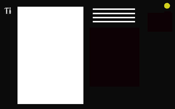
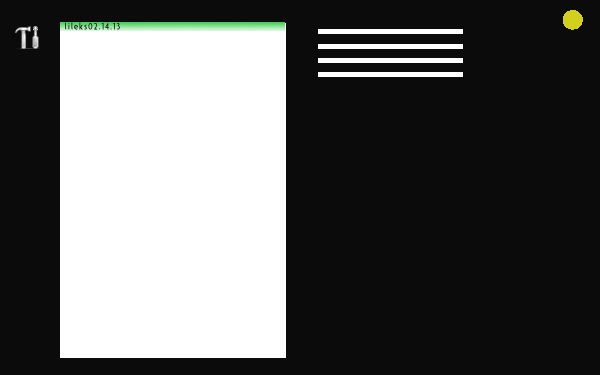
This is what you get when you open the program.
(You don’t actually open the program; it’s always open. You hit a user-defined key combination to invoke a password box. Right now you have to log into Citrix, then log into the program. Two steps.)
This is what we want to do: either start a new story, or work on an old story or look through wire / photo / personal archives. Why not NEW and OLD? Because you might have started a story yesterday that you’re still working on, and it’s not OLD. There’s just “start a new story” and “everything else.”
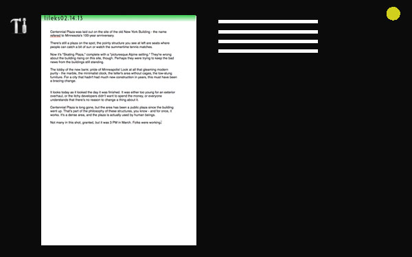
Click on NEW, and you get:
Because this is what you want to do. Write. There’s no fancy formatting. There’s no subhead / headline / subject / teaser / byline / email address / included; that comes later, and is applied with the click of the tool button.
There are no tabs because why do you need tabs? You're writing a piece.
The lines on the right are expandable palettes with user-defined functions, so you only have what you need. The empty black field is where the palettes appear. One person, for example, could use the TRANSCRIPT Palette to open a window containing the transcript of the audio file you uploaded. (Such a function, sorely needed, does not exist.) Another person could bundle together a variety of options to apply styles, override spellcheck on certain names that pop up all the time, etc. Point is, all those palettes belong to you, and reflect what you know you want to do, not what the designer of the program thinks 100 different people might need to do at some point in the process of assembling a newspaper.
But wait - don’t you have to create a file, name it, all that stuff? No. You type whatever you want for the title and it appears on the top, and the green bar and file name tells you that it’s created and exists and it's been saved. NOW YOU JUST WRITE.
So write:
At some point, you might want to format. Click on the Tools icon, and you get three options: FORMAT, SPELLING, and a submenu with more compex tools you need maybe once a month. Always keep the needlessly detailed stuff out of the workflow. Okay, click FORMAT.
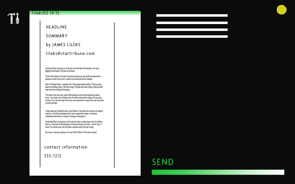
But what if you file the piece without formatting? You can’t. After it’s been formatted and is ready to go, the SEND option appears. Click to send to your default destination; right click for more detailed options. A progress bar and / or audio hint tells you it’s been successfully delivered.
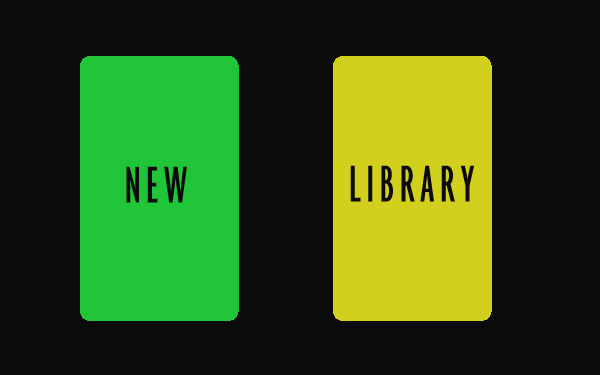
If you want to go to the library, that’s pretty obvious. The little yellow dod has the color you saw when you opened up the program, and had a choice between GREEN and YELLOW. That will bring up two panes:
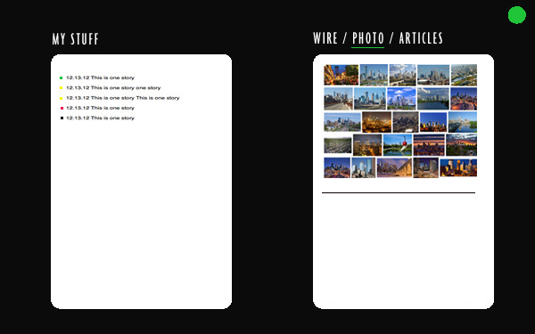
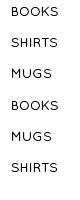
Your pieces, and all the other pieces in the world. The wires, photos, the paper’s archives. Your pieces have color codes - green for open, yellow for in-progress, red for the desk, and black for published. Clicking on a green or yellow file expands to show the various assets tied to the story - photos, fact boxes, online-only assets.
Click on a picture . . .
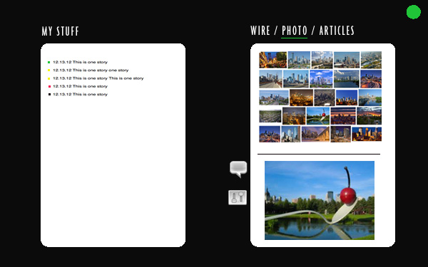
And a menu appears for adding captions, editing, destinations, and so on.
In short: menus only appear when they are needed. Power users can set all kinds of preferences; simple users can customize as well, but the program just concentrates on the things they do.
Training time? You were just trained.
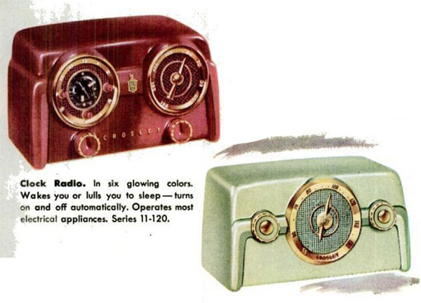
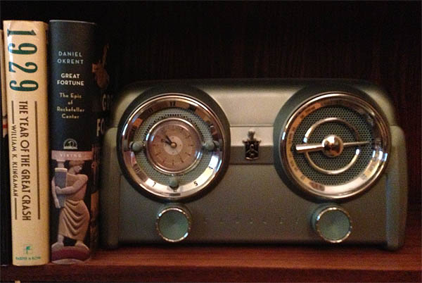
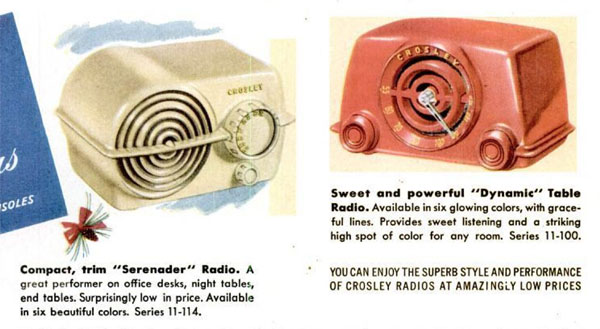
Or, you could spend 16 hours learning about this.
|