The Capp-Home Purchase Plan logo looked much like the All-Electric Home logo of the time. I doubt the Capp logo was put on houses like the Electric Home medallion, though; that would be a peculiar boast.
Neither would be acceptable today. I mean, look at that logo. It's very problematic.
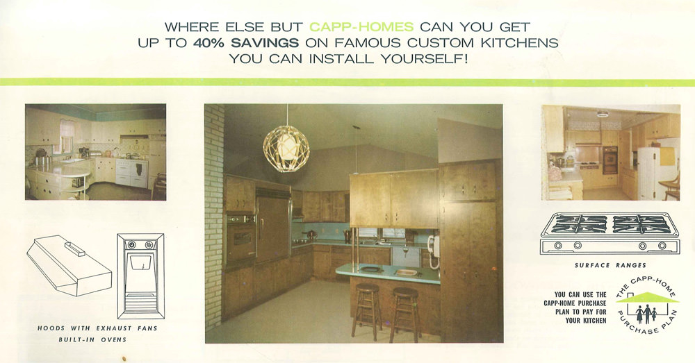
Anyway. Note the difference between the kitchen in the small left-hand picture, and the larger one in the middle. The former looks backwards; the latter looks ahead.
Things are going to get migthy square and brown before they're done.
|